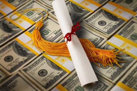
For anyone who has attempted to survey consumers and businesses, it’s pretty universally understood that in order to boost the response rate, you need to give people a “WIIFM” reason to respond.
And that WIIFM incentive is often money. But what kind of monetary incentive works best these days, considering all of the different ways that people are being asked to participate in surveys?
One thing’s for sure: the trend data on response rates isn’t encouraging. In 1997, the average response rate on telephone surveys was around 36%. As of 2012, the percentage had nose-dived to just 9%.
It can’t have gotten any better in the five years since.
Recently, the Gallup organization set about to determine response rate dynamics in relationship to the types of monetary incentives offered. To do this, Gallup took the alumni listing from a major American university and deployed online surveys to three target groups of names drawn from it.
Each group was made up of randomly selected names, and each group received the exact same survey. The only difference was in in the incentive offered for recipients to respond to the survey:
Group A: 10,000 targeted people received no monetary incentive
Group B: 1,000 targeted people were promised a $5 gift card after completing the survey (post-paid incentive)
Group C: 1,000 targeted people received a gift card as part of the survey invitation (pre-paid incentive)
The Gallup test revealed that, as expected, offering a monetary incentive had a significant impact on the survey response rate:
Group A: 13% response rate
Group B: 20% response rate
Group C: 19% response rate
But perhaps more interestingly, the results suggest that a pre-paid incentive isn’t quite as strong as offering a monetary reward that comes after filling out the survey. Albeit, the results are very similar, so no definitive conclusions can be drawn.
What is clear, though, is that offering a monetary incentive of some kind does dramatically improve survey results – to the tune of ~50% higher.
Moreover, the Gallup research found no behavioral differences between income groups, suggesting that the “psychology” of being offered a token of appreciation for the survey-taker’s time is something universally appreciated, rather than it being tied to particular respondent characteristics like financial status.
Additional information about the Gallup research can be accessed here.
In any presidential political season, there’s always plenty of rhetoric about the American economy, how well it’s performing for the average voter, and people’s perceptions of how they’re doing socioeconomically.
As it turns out, the Gallup Survey has been testing this issue annually for years now — going all the way back to 1988.
The question posed to Americans in Gallup’s surveys is a simple one: Do you consider yourself personally to be part of the “haves” or “have-nots” in America?
Gallup’s latest survey was fielded in July 2015. Nearly 2,300 U.S. adults aged 18 and older were part of the research.
In response to the “haves vs. have-nots” question, ~58% of respondents considered themselves to be “haves” in U.S. society, while ~38% placed themselves in the “have-nots” segment. (The remaining ~14% see themselves borderline between the two, or they don’t have an opinion.)
Over time, Gallup has found that the percentage of Americans who perceive themselves to be part of the “have-nots” in society rose pretty steadily from 1988 to 1998, but since that time the percentages have leveled off — even during the worst years of the Great Recession from 2009-2011.
And so, the “haves” percentage has fluctuated in a tight band between 57% and 60% in each year since the late 1990s.
It seems that heightened discussions about social inequality in America haven’t resulted in a higher percentage of people thinking that they are on the less fortunate side of the country’s socioeconomic divide.
However, considering that the latest Gallup survey was conducted in July 2015 — and that since that time there have been more news events drawing attention to the issues of social justice — one wonders if we may be on the cusp of some changing thinking on the subject.
Another persistent finding in Gallup’s surveys is this: Even among families of quite modest means (annual household incomes of $35,000 or lower), only a little more than half in that segment consider themselves to be part of the “have-nots” group.
Education-wise, the survey findings are similar, with fewer than half of the respondents who don’t possess college degrees considering themselves part of the “have-nots” segment.
In reporting on the Gallup survey results, an article published in the November 2015 issue of Quirk’s Marketing Research Review magazine stated:
“The stratification of U.S. society into unequal socioeconomic groups has long been a fixture of philosophic, political and cultural debate. It appears to have remained or even expanded as a fairly dominant leitmotif in the ongoing 2016 election, particularly among the Democratic presidential candidates.
[Nevertheless,] the results … in this analysis show that a majority of U.S. adults do not think of American society as being divided along economic lines, and a slightly higher percentage say that if society is divided, they personally are on the ‘haves’ side of the equation rather than the ‘have-nots.'”
More information about the Gallup survey results can be viewed here.
What are your thoughts? Do the perceptions Americans have of socioeconomic inequality — or the lack of it — match the reality? Or are we poised to see some new significant shifts in the way Americans view socioeconomic divisions in this country?
Americans give a big thumbs-down when it comes to having “trust and confidence” in mass media – TV, radio and newspapers.
Are Americans’ attitudes about the press becoming more negative over time? If the latest survey figures on media trust are any guide, the answer is a pretty stark “yes.”
According to a recent Gallup field survey of ~1,025 American citizens aged 18 or over, trust and confidence in the mass media in the United States has reached a new low.
Today, just ~40% of respondents report that they have “a great deal” or “a fair amount” of confidence that newspapers, TV and radio report the news “fully, accurately and fairly.”
What’s more, trust levels have been on a downward trajectory ever since the late 1990s, when Gallup began surveying Americans’ attitudes on an annual basis.
Here’s what the trend looks like in the “off-election” years:
1999: ~55% have “a great deal” or “a fair amount” of trust in mass media (TV/radio/newspapers)
2003: ~54%
2005: ~50%
2007: ~47%
2009: ~46%
2011: ~44%
2013: ~44%
2015: ~40%
Moreover, the notion that young people might be more inclined to trust the media isn’t borne out in the Gallup survey results. The trust of Americans age 18-49 has dropped from 53% in 2005 to only 36% now.
Contrast this with older Americans (age 50 or older): 45% of them reported that they had trust and confidence in mass media in 2005, and today that trust level is … still 45%:
Giving further credence to the oft-stated claim that American mass media are slanted towards one political party, ~55% of self-identified Democrats express trust in the media, compared to just 32% of Republicans and 33% of independents.
Gallup can’t resist editorializing a bit about its most recent media trust figures:
“Americans’ trust level in the media has drifted downward over the past decade, but some of the loss in trust may have been self-inflicted, as major venerable news organizations have been caught making serious mistakes in the past several years.”
Additional information on the Gallup survey can be accessed here.
Public colleges and universities (out-of-state residents): ~$23,000
Public colleges and universities (in-state residents): ~$9,100
Community colleges: ~$3,300
In fact, the difference between the highest and lowest cost averages comes out to a factor of ten.
Averages are more difficult to calculate for online college institutions, where the annual cost ranges widely from as low as $5,000 all the way up to $25,000 or so, according to The Guide to Online Schools.
With such a disparity in college education costs, one might think that public perceptions of the value of the degrees granted by them would likewise show differences based on the type of institution.
But a recently completed national opinion study tells us otherwise. A telephone research survey conducted in June 2015 by the Gallup organization queried ~1,500 Americans age 18 or over about their attitudes toward college education.
Among the most interesting findings is the perception of community colleges: Two-thirds of the respondents rate the quality of education that community colleges offer as “excellent” or “good.”
For four-year colleges, the percentage figure for excellent/good quality was only slightly higher: ~70%.
Considering the vast difference in the financial outlay required to attend a four-year school, community college education is looking mighty attractive, indeed.
Tempering this finding are the Gallup survey’s respondents who possessed advanced degrees themselves. They’re more likely to rate four-year institutions higher than community colleges on quality (a nine percentage point difference).
And of course, community colleges do face challenges such as their track record on lower graduation rates, plus the sometimes challenging process and procedures in successfully transitioning students from two-year to four-year schools.
Still, the perception of near-parity in education quality is striking — and it’s not very different from the findings Gallup has observed since beginning to survey the American public on this topic two years ago.
I don’t doubt that some families will be sharpening their pencils and doing new cost/benefit calculations based on the results of this Gallup survey.
But where a perceived difference in quality continues to persist is in online education. Survey respondents were about half as likely to rate the quality of Internet-based college programs as “excellent” or “good.”
While respondents don’t fault online programs for lacking a broad curriculum, or even for the value provided for the cost of enrolling, online education is seen as lacking strength in three key areas:
Reliable testing and grading
The quality of instruction
The value of the degree to prospective employers
But there’s another way to look at it. Internet-based higher education is slipping through the door and becoming “mainstream” not just because of the online programs such as those offered by Capella University and the University of Phoenix, but because of the burgeoning online coursework being offered by traditionally brick-and-mortar institutions.
With that growing practice, I predict it’s only a matter of time before the perception of online higher learning will match the higher ratings that are already being given to community colleges, public and private institutions.
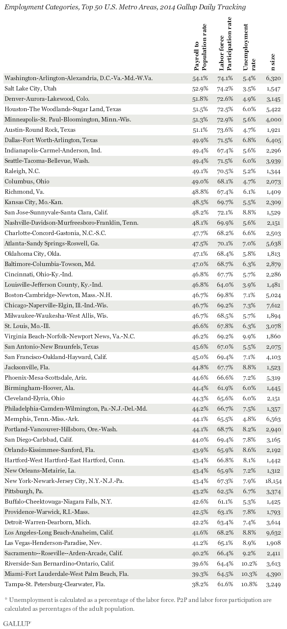
Gallup’s evaluation is limited to the top 50 most populous SMSAs (metropolitan statistical areas). But because of the large number of phone interviews conducted within each metro area (ranging from ~1,300 to 18000+ depending on the population), the findings are statistically significant whether looking nationally or within a particular urban area.
The latest surveys, conducted by Gallup in 2014 among nearly 355,000 households, find that two metro areas with the highest P2P measures are Washington, DC and Salt Lake City, UT — urban centers that couldn’t be more dissimilar in other ways.
For DC, the P2P rate is 54.1. The calculation is derived from the percentage of the adult population (age 18+) who are employed full-time for an employer for at least 30 hours per week.
For Salt Lake City, the P2P rate is just slightly lower, at 52.9.
Other top scoring metro areas include three markets in Texas (Austin, Dallas-Ft. Worth and Houston).
What about metro areas at the other end of the scale? Those would be Miami (38.2 score) and Tampa (39.3).
Three other low-scoring MSAs are located in California: Los Angeles, Riverside and Sacramento.
What do these stats mean in a broader sense?
For one thing, there’s a direct relationship between employment stats and P2P performance: Metro areas with the highest unemployment rates correlate to those with low P2P scores.
For instance, Miami’s unemployment rate in 2014 was 10.3%. It was 10.2% in Riverside, CA.
That’s a big contrast with Salt Lake City, which had an unemployment rate of just 3.5%.
I find one interesting deviation from the norm: Buffalo, NY. There, while the unemployment rate is one of the ten lowest in the country, its labor force participation rate is also very low — bottoms among all 50 metro areas, in fact.
Shown below are the figures for all of the 50 largest U.S. metro areas based on the interviews conducted by Gallup in 2014:
More details on the research findings are available here.
I’ve blogged before about how the American public doesn’t seem to be responding to the news that the country has been out of its economic recession for a number of years now.
Plus … I’m reminded often by my business counterparts who work in Europe and Asia that the situation is much better in America than in many other countries. I consider it advice to “count our blessings,” as it were.
With this as backdrop, it’s easy to fall into the paradigm of thinking that the American public is simply being unrealistic in its expectations for economic recovery — and the recovery’s ability to reach into all strata of society.
In addition to heading what is arguably America’s most famous polling company, Mr. Clifton is a keen observer of economics and public policy. He is also the author of the book The Coming Jobs War (published in 2011).
The gist of Clifton’s commentary is that the official unemployment rate, as reported by the U.S. Department of Labor, is very misleading.
Moreover, it’s Clifton’s contention that the very way the Department of Labor calculates the unemployment rate goes straight to the heart of the disconnect between the experts and the “person on the street.”
Here’s what Clifton wrote in a column released earlier this month:
“If a family member or anyone is unemployed and has subsequently given up on finding a job — if you are so hopelessly out of work that you’ve stopped looking [for work] over the past four weeks — the Department of Labor doesn’t count you as unemployed.
That’s right: While you are as unemployed as one could possibly be, and tragically may never find work again, you are not counted in the [unemployment] figure we see relentlessly in the news — currently 5.6%.”
The official U.S. unemployment rate as reported by the United States Department of Labor’s Bureau of Labor Statistics.
In Clifton’s estimation, right now as many as 30 million Americas are either out of work or severely unemployed. That would equate to an unemployment rate far higher than the reputed 5.6% figure.
But it goes even beyond that. Clifton points out another clue as to why the perception gulf between the “statisticians” and the “street” seems so wide — and he puts it in the form of two examples:
“Say you’re an out-of-work engineer or healthcare worker or construction worker or retail manager. If you perform a minimum of one hour of work in a week and are paid at least $20 — maybe someone pays you to mow their lawn — you’re not officially counted as unemployed in the much-reported 5.6% [figure].
Few Americans know this.
Yet another figure of importance that doesn’t get much press: those working part time but wanting full-time work. If you have a degree in chemistry or math and are working 10 hours part time because it is all you can find — in other words, you are severely unemployed — the government doesn’t count you in the 5.6%.
Few Americans know this.”
Clifton doesn’t mince words in his characterization of the official unemployment rate; he calls it a “Big Lie” — one which has consequences that go well-beyond simply the stats being arguably wrong.
Here’s how he puts it:
“… It’s a lie that has consequences because the Great American Dream is to have a good job — and in recent years, America has failed to deliver that dream more than it has in any other time in recent memory.
A good job is an individual’s primary identity — their very self-worth, their dignity. It establishes the relationship they have with their friends, community and country. When we fail to deliver a good job that fits a citizen’s talents, training and experience, we are failing the American Dream.”
Statisticians and economic policy experts can and do disagree about what constitutes a “good job” in America. The Gallup organization defines it as working 30 or more hours per week for an organization that provides a regular paycheck, with or without other benefits.
That’s actually a pretty low-bar for what defines a “good job.” But however jobs are defined, the U.S. economy is currently delivering at a rate of just 44%, which equates to the number of full-time jobs as a percent of the adult population (age 18 and over).
It would seem that the 44% figure would need to be significantly higher to really solve the challenge of available jobs.
Clifton concludes his commentary by issuing this challenge:
“I hear all the time that ‘unemployment is greatly reduced, but the people aren’t feeling it.’ When the media, talking heads, the White House and Wall Street start reporting the truth — the percent of Americans in good jobs; jobs that are full time and real — then we will quit wondering why Americans aren’t ‘feeling’ something that doesn’t remotely reflect the reality in their lives.
And we will quit wondering what hollowed out the middle class.”
I’ve devoted significant space in this blog post to quoting Jim Clifton’s words verbatim, so as not to change their tenor or dilute them in any way.
What do you think? Is Clifton speaking truth to power? Or is he painting an overly negative view of things? I welcome your thoughts and comments.
Coming off of Thanksgiving Day and heading into the remaining holidays of the year, with their emphasis on “giving,” it’s tempting for we Americans to think of ourselves as a generous people.
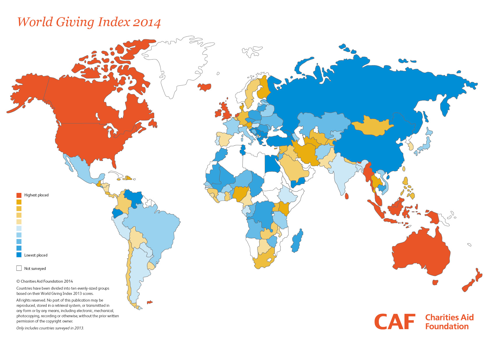
Which we are. The latest comparative analysis proves the point.
In fact, America is tied with one other country as the most generous in the world.
And that other country is … wait for it … Myanmar.
That is correct: the United States and Myanmar (Burma) each scored a 64% generosity rating in the recently published World Giving Index. The two nations were followed closely by Canada, Ireland, New Zealand and Australia.
The World Giving Index is actually an aggregated figure, calculated based on three kinds of giving:
Volunteering of time
Donating money
Helping a stranger
Data was collected in field research carried out across more than 140 countries via Gallup’s World View World Poll, then compiled by international research firm CAF-America for creating the World Giving Index based interview questions that measured the behaviors of people during the 30-day period prior to interviewing.
A sampling of adults in each of the countries was interviewed, with the percentages of people participating in each of the three behavioral attributes collected. The scores were amalgamated to determine the overall index score per country.
How did the United States achieve its first-place tie? It ranked #1 among all surveyed countries in helping a stranger (a participation score of 79%) … #5 in volunteering of time (a score of 44%) … and #9 in donating money (a score of 68%).
Myanmar’s route to the shared top spot was different: It ranked #1 for donating money (a participation score of 91%) … #2 for volunteering time (a score of 51%), but only #49 for helping a stranger (a score of 49%).
This 2014 World Giving Index “heat map” shows which nations are the most generous. (Gallup survey data amalgamated by CAF.)
For the record, here’s how the Top 10 countries fared in terms of their overall World Giving Index scores:
#1 (tie) USA: 64% World Giving Index score
#1 (tie) Myanmar: 64%
#3 (tie) Canada: 60%
#3 (tie) Ireland: 60%
#5 New Zealand: 58%
#6 Australia: 56%
#7 (tie) Malaysia: 55%
#7 (tie) United Kingdom: 55%
#9 (tie) Sri Lanka: 54%
#9 (tie) Trinidad & Tobago: 54%
Looking at the Top 10 list – and also at where the other countries surveyed fell further down the roster – it appears that living in a prosperous economy doesn’t necessarily translate into being more charitable.
If that were the case, we’d see the G20 economies making up the top tier — which they don’t.
“Aspiring” economies also don’t show up particularly well, either. The so-called BRIC nations (Brazil, Russia, India and China) are nowhere to be found in the Top 10 ranking.
The MINT nations (Mexico, Indonesia, Nigeria and Turkey) are no-shows, too.
Myanmar poses a very interesting case. It’s 91% rating of people giving money reflects a practice of charitable giving (daana) that is a centerpiece tenets of religious observance amongst the Theravada Buddhists that thrive in the country.
And in the United States, charitable giving participation rates have grown significantly in the years since the Great Recession, so that today about two-thirds of adults reported donating money within 30 days of when they were interviewed.
“Social media are not the powerful and persuasive marketing force many companies hoped they would be.” — Gallup, Inc.
That’s one of several key conclusions from a report issued this past summer by research firm Gallup, Inc. The report examined the influence of social media on consumer purchase decision-making.
The Gallup findings are based on web and mail polling it conducted with ~18,000 American consumers during 2013.
When asked about the influence of social media on buyer behaviors, ~62% of the respondents reported that social media has “no influence at all” on their purchasing decisions.
By contrast, ~30% stated that social media has “some influence,” while only ~5% reported that social media has “a great deal of influence” over their purchasing decisions.
Compare these middling results with the fact that U.S. companies spent well over $5 billion on social media advertising in 2013, and the two figures seem out of proportion.
Actually, the disconnect between “people and products” on social media shouldn’t be too surprising, in that ~94% of the Gallup respondents reported that the reason they go on social media platforms is to connect with friends and family members.
The percentage of people who use social media to follow trends and/or to find reviews or other information on products is far lower: ~29% according to the Gallup survey.
But it’s the magnitude of the difference that may be surprising.
And here’s another thing: In its report, Gallup states that “consumers are highly adept at tuning out brand-related Facebook and Twitter content.”
It’s yet another data point supporting the growing realization that social media has failed to live up to its early marketing hype. So it should come as little surprise that more companies have been refining their strategies to stress quality over quantity when it comes to both fan acquisition and to published content.
More findings from the Gallup report can be viewed here.
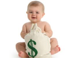
Anyone who has children – present company included – knows intuitively that raising them isn’t an inexpensive proposition.
The education expenses alone are enough to make some people blanch white at the prospects of child-rearing.
And now we have even more proof of the high cost of having kids. The Gallup organization has just completed a telephone survey of a large sample of American adults age 18 and over – more than 172,000 of them, in fact.
When Gallup asked these respondents how much they spent on purchases “yesterday” (excluding normal household bills and major purchases), it discovered that those without kids under age 18 reported average daily spending of ~$80.
For those with children under the age of 18? They spent ~$110 on average.
So it’s a pretty significant difference of 35%+ more.
Gallup found similar dynamics at work even when comparing adults within the same income groups.
In every income segment, average daily spending levels were lower for adults with no children … spiked for those with kids under 18 … and then dropped back again when children are over the age of 18.
The reasons for the added spending aren’t difficult to figure out, of course. In addition to basic necessities like food and clothing, there are entire categories of spending that come into play for families raising children: extracurricular activities, athletics and sports, entertainment, toys and so forth.
Gallup also discovered similar “bell curve dynamics“ at work when comparing adults within the same age groups. Whether you’re younger or older, your daily spending rises when you have kids under age 18, then drops back down again.
The bottom line: Having kids is costly. But they sure do make life interesting, don’t they?
How much do American consumers spend in an average day? According to a July 2012 Gallup Poll, they spend about $70 per day in stores, gas stations, restaurants and online. (Housing, utility costs and vehicle purchases are extra.)
It turns out that this figure is a pretty big drop from the average daily spend of $104 Gallup found in 2008.
That meme we’re hearing on the campaign trail about people’s livelihoods having shrunk over the past three or four years? Evidently, it’s a fact.
And Gallup is also finding that upper-income Americans have undergone the same degree of spending reduction as everyone else. Their spending is now down to about $116 per day.
Evidently, confidence in the U.S. economy and the stock market’s uneven performance have taken their toll on the psyche of even the affluent classes in America. And Gallup isn’t the only organization charting this. Ipsos MediaCT is finding a similar story in its surveys.
Last week, Stephen Kraus, an Ipsos senior vice president and author of several books on the upper-income sector of society, wrote: “Widespread uncertainty plays a role in a fundamental fact of today’s “affluent” marketplace. For the most part, affluents today simply don’t feel affluent.”
Krauss continues, “This feeling isn’t new; for most, it is part of the lingering hangover of The Great Recession. But it is particularly pronounced in the summer of uncertainty.
Krauss concludes his remarks with this rather gloomy observation: “It’s a summer of uncertainty indeed – about the economy, about the future, and even about one’s own standing in today’s financial hierarchy.”
Reading these very latest reports on the level of uncertainty – even resignation – that people have about the economy, it underscores the collective funk the American people seem to be in as the 2012 presidential campaign grinds on inexorably to its conclusion.
Perhaps once Election Day has come and gone, Americans will “snap out of it” and begin to feel brighter about the future.

 For anyone who has attempted to survey consumers and businesses, it’s pretty universally understood that in order to boost the response rate, you need to give people a “WIIFM” reason to respond.