Grand Funk: PC Sales are in the Doldrums

PC sales decline in 2012
Eyebrow-rasing stat: Worldwide PC shipments declined in 2012 … the first drop since 2001.

If people had any doubts about the inexorable rise of tablet devices and smartphones, the sales results for the holiday season would surey erase them.

In fact, for the first time in five years, holiday PC sales have actually declined. Tech industry tracking firm IDC reports that personal computer manufacturers sold just shy of 90 million units worldwide during the last quarter of 2012. That’s down more than 6% compared to PCs sold in the final quarter of 2011.

What makes the news doubly troubling for the PC segment is that, unlike in 2009 when sales of all tech devices were hammered by a worldwide recession, this time around sales of other devices such as tablets and smartphones have grown substantially.

And considering 2012 as a whole, the news is even worse. The estimated 352 million PCs sold were ~3% lower than in 2011, which makes this the first annual decline in more than a decade – since 2001 in fact, when the 9/11 attacks roiled markets and impacted sales of all goods across the board.

And it isn’t trouble for just one manufacturer, either: The 2012 sales drop hit all of the big players including Dell, HP and Lenovo.

What about the prognosis for 2013?

It’s not much better. IDC is forecasting mediocre growth in the PC segment (less than 3%) — although at least that isn’t a decline.

But on the downside, it’s very possible that tablets will actually outsell PCs in 2013 – a possibility that would have seemed unthinkable just one or two years ago.

We’re hearing a number of explanations for the slump in PC sales. One of those is that Microsoft’s new Windows 8 operating system isn’t doing much to excite buyers – at least not so far.  The surge in new PC hardware purchases, which commonly occurrs when newer versions of Windows have been introduced, hasn’t happen this time around.

More fundamental than the Windows 8 conversion rate are signs that PCs are losing their edge over other devices in the perception that they’re the most secure, reliable and efficient options.

This shift may be less about PCs themselves or their quality, and more about the aggressiveness by folks like Apple iPad and their incursions into the PC “space.”

What’s the value of a consumer’s time spent online?

The value of a consumer's time onlineIf you’ve ever wondered what the “value” is of a consumer spending time online, we have some answers courtesy of SumAll, a data visualization company.

SumAll has tapped into Google Analytics data to study patterns across ~10,000 customers and nearly $1 billion worth of transactions. What it finds is that a minute of time spent by a consumer “e-window shopping” is worth an average of 43 cents.

SumAll also calculates that one full visit to an e-commerce site is worth ~$1.30.

The company has been tracking this sort of information for a number of years, so we have some comparative statistics we can observe. In 2012, SumAll finds that the average amount of time spent per site declined by approximately 14% — from 3 minutes, 16 seconds in 2011 to 2 minutes, 49 seconds today.

Despite that decrease in time spent per online visit, the revenue generated per visit actually grew by ~24%.

What’s the reason? “Buyers are more accustomed to buying online, so the hesitation is dropping,” Dane Atkinson, SumAll’s CEO claims.

The SumAll data also suggest that an average consumer spending 1 minute, 54 seconds on a site is the amount of time needed in order for the e-retailer to make a dollar in sales.

The SumAll report concludes that a balance needs to be struck on e-commerce sites between having enough depth to be interesting … but not so much as to be overwhelming, with too many products offered and/or undue difficulty in illuminating the payment path for buyers.

According to Atkinson, aiming for an average e-commerce visit of three to four minutes is a good goal for engaging customers without confusing them with too many options.

Finally, we see from the trend data that there has been a dramatic decrease in the amount of minutes spent on a site to result in a dollar sale: it was charted at over 5 minutes back in 2009, more than three times 2012’s findings.

I guess we’ve become more nimble than ever buying online.

TMI: The Seduction of Data

The Seduction of DataIt was the Roman philosopher Seneca who once remarked, “The abundance of books is a distraction.”

(He said it in Latin, of course.)

Fast-forward 2,000 years … and we’re dealing with the same phenomenon – on steroids.

Jonathan Spira, author of the book Overload: How Too Much Information is Hazardous to your Organization, calculates that “info-inundation” and the productivity inefficiencies that emanate from it costs the U.S. economy around $1 trillion per year.

But how can anyone combat the information explosion and not risk missing out on something important? After all, no one wants to be left behind when it comes to “knowing what needs to be known.”

But there are some small things you can do to help control your information environment. Spira and others suggest a few tips:

  • Skim and scan information first rather than digging deep from the get-go. More than 80% of it is likely dispensable.
  • Set aside some quality “thinking time” to properly digest what is truly important from what you just consumed.
  • Engage in more “real-time” interactions with colleagues rather than wasting energy over long e-communiqués and missed communications.

A related issue is whether “too much” information actually hinders good decision-making. That possibility was studied by psychologists at Princeton University and Stanford University more than a dozen years ago in research that seems even more pertinent and consequential today.

The researchers studied two groups of people. Each group was presented the same set-up: A person with a well-paying job and a solid credit history is applying for a bank loan. The issue facing the two groups is whether to reject the loan application because a background check has uncovered the fact that for the past three months the loan applicant has not paid on a debt to his charge card account.

Group A was informed that the amount of the card account charge was $5,000 … while Group B was told that the amount was either $5,000 or $25,000. Participants could decide to approve or reject the application immediately, or they could hold off making their decision until more information was available.

It was later revealed to Group B participants that the applicant’s debt was only $5,000 rather than $25,000. So eventually both sets of participants had the same information upon which to make their decision.

The experiment’s findings, published in a report titled On the Pursuit and Misuse of Useless Information, revealed the interesting final result: In what clearly should be a cut-and-dried decision to reject the loan application, more than 70% of Group 1 participants dutifully did just that. They rejected the loan application, properly protecting the bank from undue financial risk.

Group 2? Only about 20% rejected the application.

The Princeton/Stanford study concluded that even though both groups possessed the same exact information, Group 2 revealed an intriguing blind spot when it comes to the way many people make decisions: They’re passionately interested in filling information gaps.

But the compulsion to seek out the added information can actually lead people to delay making decisions for too long … or ultimately to make the wrong one.

Making the siren call of info-inundation all the more dangerous, the explosion of information that’s at our fingertips thanks to the Internet means there’s always “one more report” … ” one more evaluation” … “one more perspective” to seek out and consider.

It’s the seduction of data … where sometimes “more” can be “less.”

Newspaper Ad Revenues Plummet to a 60-year Inflation-adjusted Low

Newspaper advertising revenues decline to 1950 levels in inflation-adjusted dollars.Newspaper ad revenues have now collapsed to a level not seen since the 1950s in inflation-adjusted dollars. 

That’s the sobering conclusion from the Newspaper Association of America’s release of the most recent advertising revenue figures for the U.S. industry.

With these dismal statistics, the newspaper industry seems sure to contract even further, while getting precious little boost from their online advertising activities.

Clearly, when it comes to media, it’s “out with the old” and “in with the new” …

Election Campaign News Consumption: What a Difference a Dozen Years Makes

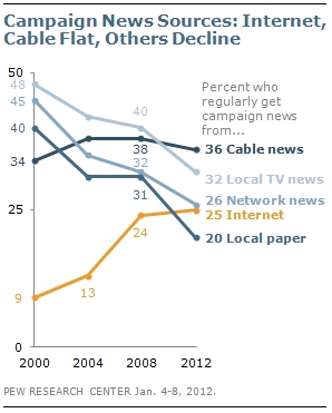
Trends in Campaign News Sources (Pew Surveys)One of the interesting aspects of the U.S. presidential elections that come along every four years is the opportunity to see how Americans are getting their political news. That’s because the Pew Research Center for People & the Press conducts a survey every presidential election year to find out those very behaviors.

The 2012 survey of ~1,500 voting-age Americans older was fielded earlier this year. It found that fewer people are following news about the campaign compared to four years ago.

That’s hardly surprising, given that the “heady and hopeful” campaign rhetoric of 2008 has given way to nothing more than a long, hard slog in 2012. 

What’s more interesting is to see how campaign news consumption behaviors have changed.

If we compare survey results this year against those of 2000 – a dozen years ago – it quantifies what many suspect has been happening: a big decline in traditional news sources like newspapers and network news in favor of the Internet.

In response to Pew’s question as to where consumers are regularly getting their campaign news, here are the comparisons between 2000 and 2012:

  • Cable TV news: Rose from 34% in 2000 to 36% in 2012
  • Internet: Jumped from 9% to 25%
  • Local TV news: Declined from 48% to 32%
  • Network news: Declined from 45% to 26%
  • Local newspaper: Dropped from 49% to just 20%

[Interestingly, the Internet as a source for campaign news has actually leveled off since 2008, when 24% reported it being a regular source for news. In the previous four-year cycle, that source had doubled in popularity.]

The most popular Internet sources for campaign news are the usual suspects:

  • CNN: ~24%
  • Yahoo: ~22%
  • Google: ~13%
  • Fox News: ~10%
  • MSN: ~9%
  • MSNBC (NBCNews): ~8%

But what about social media, the newest kid on the block when it comes to news sources? The Pew survey reveals that social media are being used by a pretty limited audience for presidential politics: ~20% report that they regularly or sometimes receive campaign information from Facebook, and only ~5% say the same about Twitter.

More details on the Pew survey – perhaps more than you ever wanted to know – can be found here.

Amtrak and the $16 Hamburger

Amtrak logo
Amtrak changed its logo in 2000 from the “pointless arrow” to the “fancifal splotch.”

What are we going to do with Amtrak? Over the past three decades since the rail line was formed as the “for-profit,” government-owned National Railroad Passennger Corporation, it has lost money year after year – all the while taking in more than $25 billion in government subsidies.

I’d be the first to admit that along Amtrak’s passenger routes are some of the most beautiful scenery one could ever hope to see. I’ll never forget a train trip my wife and I once took from Minneapolis-St. Paul to Seattle and back. The Empire Builder route travels across the plains of North Dakota where the cloud-to-ground lightning at night was a sight to see. And the trek through Glacier National Park and the Cascade Mountains of Washington State was equally memorable.

Of course, the price of our train tickets didn’t begin to cover what it actually cost to have us travel on the Amtrak train.

At the other end of the country, I enjoy taking jaunts to New York City from Wilmington, DE. It’s reasonably quick, it means I don’t have to face traffic jams on the New Jersey Turnpike, and it gets me into the middle of Manhattan without having to worry about parking (or the Holland Tunnel for that matter).

[I will say that seeing the “wonders” of post-industrial North Philadelphia and Chester along the train route to NYC is distinctly different than taking in the vistas of the Rocky Mountains!]

But the same question arises here as well: How much is the government kicking in for each ticket that I buy? We may not know that answer, but we do know how much Amtrak is losing on every hamburger they serve on the train.

It costs AMTRAK ~$16 to make a hamburger which is sold on the train for $9.50 … and the taxpayers cover the difference.

It’s one thing to lose money on the transportation service. But to lose money on the foodservice as well is … hard to swallow. Hungry customers trapped on a train with nowhere else to purchase food – how difficult can this be?

In the tortured reasoning of Amtrak, if the train doesn’t serve food, fewer people will ride, thus causing a further reduction in operating revenue.

But here’s the rub: Amtrak ridership in 2011 increased ~5% over the previous year. But operating losses went up four times as fast (~20% over the same period) to more than $900 million.

So isn’t this rich: Amtrak has a business plan that doesn’t work whether ridership goes up or down. 

And another thing:  I wonder if contracting out foodservice to a private entity has even been considered?

In the great tradition of the government jumping into commercial ventures — and then messing it up big-time when it comes to efficiency, the intent was to structure Amtrak so it would deliver a service that would be profitable while also serving the public interest.

And the U.S. Congress has gone back to the well numerous times to “tweak” and “adjust” the program so that it does just that.  For example, the Amtrak Improvement Act of 1981 prohibits the government-owned company from selling food products at a loss.  (Not that this has had any noticeable impact.)

Additional legislation passed in 1997 “mandated” a path to profitability for Amtrak – but with no specific changes to train routes, ticket pricing, employee head-count or wages outlined.

The way I see it, the abysmal performance of government-owned Amtrak is a direct consequence of several factors:

  • High overhead costs
  • Federal bureaucracy
  • Lack of agility and nimbleness
  • Lack of market incentives

It becomes all too tempting to overlay the Amtrak experience onto what will likely happen in other areas where the government has stepped in to regulate activities – like in health insurance exchanges, health care costs and quality of care.

But, you know, if there are problems that arise with healthcare, we can always pass supplemental legislation to “fix it” – just like we did with Amtrak in 1980 and 1997.

And that will solve everything.

Plain as Day: The Labor Market Recovery is Non-Existent

The single most accurate indicator of labor-market health is the employment-to-population ratio.

Unfortunately for the United States, it’s not looking any good … and it hasn’t for over two years.

People say a picture is worth a thousand words.  In this case, a chart is worth many more.

[Actually, it would be nice if this chart got all of the politicians to stop blubbering away with their thousands of words, and instead take some time to truly ponder what the data is telling us!]

Employment-to-Population Ratio
Can politicians cut the B.S. and focus instead on what this chart is telling them? Don’t hold your breath.

Password Pandemonium

Too many user names and passwords to remember ...It seems that many people have been heeding admonitions from seemingly everywhere that they should refrain from using the same user name and password for their various online accounts.

“Password creep” has been the result. Just how much so is revealed in a recently published research studied from social web SaaS provider Janrain, in concert with Harris Interactive.

The 2012 Online Registration & Password Study found that nearly 60% of online adults have five or more unique passwords associated with their online logins.

One-third of the respondents report that they maintain 10 or more passwords. And ~10% report having more than 20 individual passwords.

These figures are up significantly from the first Janrain study, which was conducted back in 2006.

Of course, when one considers the myriad of online activities many people engage in, it’s not hard to fathom how the number of passwords per user has become so large.  Consider all of these possibilities just for starters:

  • Retail sites and loyalty programs
  • TripAdvisor, Angie’s List, Yelp! and other review sites
  • Facebook, Twitter and other social networking sites
  • LinkedIn, Career Builder and other career-oriented sites
  • Google, Yahoo and other e-mail/search portals
  • PayPal and other payment, banking and financial sites
  • Hobby sites and discussion boards
  • Personal blogs

And the list goes on …

The Janrain/Harris study also uncovered several interesting findings based on age and gender demographics:

  • Older people (age 55+) are more likely to have a higher number of unique passwords than younger adults.
  • Men age 45-54 report having the highest average number of unique password (~10).

There’s no question that people have heeded the warnings about using passwords that are too easy to “game” … and thus are creating passwords that incorporate a combination of letters, numbers and other symbols.

But the downside is a considerable percentage of people forgetting their passwords frequently. 

In fact, more than one-third of the respondents reporte that they have had to ask for assistance on their user name or password at least once in the past month.

And another thing: The vast majority of people (~85%) dislike being asked to register to access information on a new website.

What did they dislike in particular? Half of the respondents complained about having to create and remember yet another user name and password. And ~45% believe that online registration forms are too long and time-consuming to complete.

Despite the irritations of “password pandemonium,” it’s doubtful many online consumers are going to be changing their behaviors very soon.

One alternative would be to create a few strong, secure passwords that are used across multiple sites but changed regularly.  But to many, that “cure” is no better than the “disease” they have already.

Twitter Followers: Fake, Faux or Farcical?

Fake followers:  They're all over Twitter
Fake followers: They’re all over Twitter.

I’ve blogged before about the nagging suspicions many people have about the true level of engagement on Twitter. Some have referred to Twitter accounts as “digital Potemkin Villages” and other (unprintable) characterizations.

And now we have the latest indications that Twitter’s “blue smoke and mirrors” extends to the most important global brands.

Status People, a purveyor of social media management platforms, has develop an analytical tool it calls the “Fake Follower Checker” that evaluates the characteristics of brand followers to determine to what extent they are “real people” as opposed to fakers.

According to Status People, up to half of the followers of the 20 most important global brands are either complete fakes, or inactive.

Of course, it is possible that some brand followers do nothing but follow … and rarely if ever post tweets of their own. But it’s also easy to surmise that the value of an inactive follower isn’t nearly as high as one who engages on the Twitter platform.

Details on how Status People conducts its Twitter follower analysis can be found here. In a nutshell, Status People sampled up to 1,000 records and assessed activity against a number of spam criteria. Those criteria included the degree to which Twitter accounts have few or no followers and few or no tweets … but that follow many other Twitter accounts.

For the record, here are the proportion of major brand followers on Twitter that Status People deems are “good” versus “inactive” or “fake,” ranked from highest to lowest percentage score:

  • Gillette: 64% “good” followers
  • GE: 61%
  • Oracle: 60%
  • Toyota: 60%
  • Cisco: 54%
  • IBM: 53%
  • Mercedes: 53%
  • H-P: 52%
  • Disney: 51%
  • McDonalds: 51%
  • Coca-Cola: 50%
  • Honda: 50%
  • Louis Vuitton: 50%
  • Samsung: 46%
  • Intel: 44%
  • BMW: 43%
  • Microsoft: 42%
  • Nokia: 37%
  • Google: 27%

And what about one of the biggest U.S. brands out there right now:  Brand Obama?  Of the President’s nearly 19 million followers on Twitter, the reports are that nearly three-fourths of them are fake, too. 

Some have questioned why Status People has gone to all of this effort shine a light on Twitter fakery. “What harm is done?” these folks seem to be asking.

In response, Status People contends that fake Twitter accounts exist to build status and power beyond what is legitimate, and that those behind them are gaming the system in an effort to burnish brand credentials unfairly.

But I think it’s actually worse than that.  Twitter fakers run the risk of turning the entire Twitter enterprise into one big farce. I know too many people who have completely turned away from Twitter in the past year, becoming convinced that the entire platform is simply an elaborate façade masking a “whole lot of nothing.”

This can’t be what the folks at Twitter want people to think of their own brand!

Online display advertising’s clickthrough performance: Now it’s just embarrassing.

poor online display ad clickthrough ratesRecently, several executives at the Advertising Research Foundation, the online analytics firm Moat and media buying company Accordant Media created six completely blank online display ads – no copy and no images – in three standard sizes and two colors.

The idea was to test the veracity of information being collected on clickthroutgh rates in online advertising and the algorithms that drive automated ad buying and selling — ads being automatically served where they will generate the most clicks.

Once the ads had been created, the crack team had them served via a demand-side ad platform, using both run-of-exchanges as well as being trafficked to publishers that would accept unaudited copy.

The idea was to see what sort of clickthrough rate would be garnered by these “faux” ads.

It’s common knowledge that clickthrough rates for online display advertising are abysmally low. But what transpired in the ARF-led team’s “nothing-doing” ad campaign was startling, to say the least.

The average clickthrough rate on these ads, across 1 million+ impressions served, was 0.08%

That clickthrough rate rivaled the better results achieved by online branding campaigns … and isn’t very far off the average performance for a direct response effort!

The team noted that the modest cost of this research effort (less than $500) was a “pretty good deal for a diagnostic check-up on a $100 billion machine.”

And what are those results telling us? A couple things, I think:

  • If you believe these clickthroughs are legitimate, there’s not much difference between someone clicking on an ad by mistake and the degree of intentional interaction with actual online branding campaigns.
  • If you believe that these clickthroughs might be happening to generate click rates that someone can roll up into an ROI calculation … you might be correct, too.

But ARF’s Ted McConnell reported that a follow-up screen appearing once an ad was clicked asked why the person who clicked did so — out of curiousity or by mistake. 

Here’s what McConnell reported:  “We detected no click fraud in the data we counted.  Half the clickers told us they were curious; the other half admitted to a mistaken click.”

McConnell noted that the team went beyond the follow-up query in its investigation.  “To obtain further insights, we tracked hovers, interactions, mouse-downs, heat maps — everything.  (Heat maps detect click fraud because bots tend to click on the same spot every time.)”

So, what’s the major takeaway finding from this experiment? 

If it’s that online brand advertising campaigns are going to deliver abysmal engagement, you already knew that. 

But if you think achieving a clickthrough rate of 0.04% or 0.05% for an online brand advertising campaign is an indication of anything in particular, you’re probably off by miles, too.

Was this “nothing-doing” research worthwhile, seeing as how it didn’t test “real” ads? 

I think it was … because the findings are telling us that below some threshold level, what we’re really experiencing is just noise. That’s not exactly what the online display advertising advocates want to hear …