The Music of Your (Work) Life

Well, yes and no …

I’ve been in business long enough that I can remember a time when it was pretty commonplace for the radio to be playing in the background in offices and other work settings.  Sometimes the result of doing so was a bit distracting – most especially during radio program commercial breaks, but also the general distraction of hearing the radio announcers.

These days, the only workplace where I hear the radio playing is at the office of my dentist.  Perhaps they think their patients don’t have any choice but to sit captive in the operatory chair, so it doesn’t matter if the “irritation quotient” is high or not.

On the other hand, one of the things workers can do today is craft their own streaming-service playlists, filled with the kind of music that they prefer to hear.  And with so many people working from home in the wake of the coronavirus pandemic, it’s little surprise that playlists have become increasingly popular.

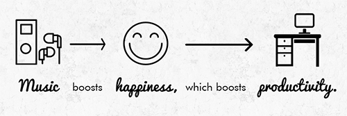
One question we might ask is if the music we listen to while working helps with our productivity, or hinders it.

It’s a topic that’s of interest to companies such as OnBuy.  This UK-based online marketplace has conducted a study of ~3,000 people, enlisting them to complete ten short tasks with music playing in the background to find out how many of the tasks they could complete when various different songs were playing.

The research subjects worked their tasks while hearing a range of different songs – and as it turns out, there were significant differences in productivity based on the songs that were playing.

According to the OnBuy study, the most productive music to work or study by were these five songs:

  • My Love (Sia)
  • Real Love (Tom Odell)
  • I Wanna Be Yours (Arctic Monkey)
  • Secret Garden (Bruce Springsteen)
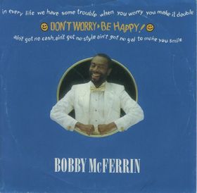
  • Don’t Worry, Be Happy (Bobbie McFerrin)
Don’t Worry, Be Productive: Bobby McFerrin

The research participants were able to complete an average of six of the ten assigned tasks within the duration of those five songs.

At the other end of the scale, these songs were determined to be poor for productivity, with participants able to complete just two of the assigned tasks, on average, while they were playing:

  • Dancing With Myself (Billy Idol)
  • Roar (Katy Perry)
The Pointer Sisters: Everyone’s excited, but productivity takes a beating.

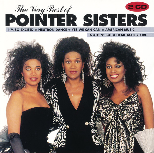
And at the bottom of the barrel? Of the songs tested, I’m So Excited by the Pointer Sisters was the worst one for productivity.

More generally, the OnBuy study discovered an inverse correlation between a song’s beats per minute (BPM) and productivity levels:  The higher the BPM, the less productive people were in completing their assigned tasks.

This is probably why I’m much more productive when listening to music that has practically no BPM associated with it – whether it’s the ambient music of Brian Eno, piano preludes by Claude Debussy, or the nature music of Frederick Delius.

Of course, when it comes to work productivity, nothing beats complete silence.  That’s the surefire way to be the most productive – but it isn’t nearly as nice, is it?

How about you?  What kind of music appeals to you — and works for you — while working?  Please share your thoughts with other readers here.

Business owners give the lowdown on workplace — and their own — productivity.

The owner of a business is arguably the single most important employee on the payroll. As such, the findings from a recent survey of business owners conducted by The Alternative Board are revealing.

According to the survey, which was conducted in May 2017, the typical business owner reports having only about 1.5 hours of uninterrupted, high-productive time per day.

Four in five of the business owners reported that they feel most productive in the mornings. It stands to reason, then, that nearly nine in ten respondents reported that they prefer to get the most important tasks of the day out of the way first.

The majority of respondents reported that they are most productive working from the office, but nearly one-third of them reported that most of their work is done from their home.

A majority of the respondents also reported that they spend the biggest block of their daily time on e-mail activities.  Tellingly, less than 10% feel that this is the most important use of their time.

Asked to report on what factors are working against their employees achieving a high level of productivity in the owner’s business, these following four factors were named most frequently:

  • Poor time management: ~35% of survey respondents cited
  • Poor communications: ~25%
  • Personal/personnel problems: ~18%
  • Technology distractions: ~16%

Taken as a whole, these findings suggest that while there are certainly issues that affect business productivity, business owners have it within their power to improve time management, foster better communication between employees, and ultimately run a tighter ship.

More findings from the TAB research can be found on this infographic.

Are boomerang kids the “new normal” now?

I’ve blogged before about how the Great Recession and resulting high unemployment rates drove a significant number of young adults back into their childhood homes — or relying on Mom and Dad for financial support at least. It affected millions of young adults.

The economy and job prospects have been steadily improving since those dark days – even if the improvement hasn’t been as rapid as people would like to see …

But here’s an interesting finding: Those new jobs and the improving economy haven’t resulted in the kids moving back out of the house.

In fact, two studies conducted by the Pew Research Center in 2016 have determined that “living with parents” is now the single most common living arrangement for America’s 18-34 year olds.

That is correct: Instead of living with a spouse, a partner, a roommate or on his or her own, the largest single segment of millennials lives full-time with parents.  The phenomenon is most prevalent in Connecticut, New Jersey and New York, where it’s no coincidence that the cost of living is much higher than the national average.

For marketers, this means that the once-coveted 18-34 year-old cohort is today made up of many people who are consuming other people’s resources (e.g., the resources of their parents) rather than making all of their own purchase decisions and spending their own money.

Furthermore, Pew Research has determined that living with parents isn’t merely about employment (or the lack thereof). Over the past eight years, adults age 18-34 have continued to move back home in greater numbers — even as more of them have been able to find jobs.

The Pew findings suggest yet another surprising trend that appears to be in the making – that this is the first American generation where a large portion of the people won’t ever purchase a home.

It’s easy to figure that trends of this kind are transitory. But Pew cautions that the trends may well be more fundamental than the implications of an economic recession.  Instead, there are broader cultural dynamics at play – as well as the long-term challenges of economic independence for this generation of people.

The implications for marketers are intriguing, too.  For some, it will mean placing more emphasis on marketing initiatives aimed at parents, who are the now ones making purchase decisions within a larger multi-generational household — often one that stretches over three generations rather than just two.

And consider these dynamics as well: How do young adults and their parents work through multi-generational purchase decisions?  What are the most effective ways to target and reach multiple generations living under one roof who are making coordinated purchase decisions?  Maybe the old ideas of targeting each audience separately no longer make as much sense as before.

One thing’s for sure – it’s risky for marketers to wait for a return to normal … because that “normal” likely isn’t coming back.  Better to come up with new tactics and new messaging to reach and influence buyers in the new multi-generational environment.

Where’s the Best Place to Live without a Car?

For Americans who live in the suburbs, exurbs or rural areas, being able to live without a car seems like a pipedream. But elsewhere, there are situations where it may actually make some sense.

They may be vastly different in nearly every other way, but small towns and large cities share one trait – being the places where it’s more possible to live without a car.

Of course, within the larger group of small towns and larger cities there can be big differences in relative car-free attractiveness depending on differing factors.

For instance, the small county seat where I live can be walked from one side of town to the other in under 15 minutes. This means that, even if there are places where a sidewalk would be nice to have, it’s theoretically possible to take care of grocery shopping and trips to the pharmacy or the cleaners or the hardware store on foot.

Visiting restaurants, schools, the post office and other government offices is also quite easy as well.

But even slightly bigger towns pose challenges because of distances that are much greater – and there’s usually little in the way of public transport to serve inhabitants who don’t possess cars.

At the other end of the scale, large cities are typically places where it’s possible to move around without the benefit of a car – but some urban areas are more “hospitable” than others based on factors ranging from the strength of the public transit system and neighborhood safety to the climate.

Recently, real estate brokerage firm Redfin took a look at large U.S. cities (those with over 300,000 population) to come up with its listing of the 10 cities it judged the most amenable for living without a car. Redfin compiled rankings to determine which cities have the better composite “walk scores,” “transit scores” and “bike scores.”

Here’s how the Redfin Top 10 list shakes out. Topping the list is San Francisco:

  • #1: San Francisco
  • #2: New York
  • #3: Boston
  • #4: Washington, DC
  • #5: Philadelphia
  • #6: Chicago
  • #7: Minneapolis
  • #8: Miami
  • #9: Seattle
  • #10: Oakland, CA

Even within the Top 10 there are differences, of course. This chart shows how these cities do relatively better (or worse) in the three categories scored:

Redfin has also analyzed trends in residential construction in urban areas, finding that including parking spaces within residential properties is something that’s beginning to diminish – thereby making the choice of opting out of automobile ownership a more important consideration than in the past.

What about your own experience? Do you know of a particular city or town that’s particularly good in accommodating residents who don’t own cars?  Or just the opposite?  Please share your observations with other readers.

Where the Millionaires Are

Look to the states won by Hillary Clinton in the 2016 presidential election.

Proportion of “millionaire households” by state (darker shades equals higher proportion of millionaires).

Over the past few years, we’ve heard a good deal about income inequality in the United States. One persistent narrative is that the wealthiest and highest-income households continue to do well – and indeed are improving their relative standing – while many other families struggle financially.

The most recent statistical reporting seems to bears this out.

According to the annual Wealth & Affluent Monitor released by research and insights firm Phoenix Marketing International, the total tally of U.S. millionaire households is up more than 800,000 over the past years.

And if we go back to 2006, before the financial crisis and subsequent Great Recession, the number of millionaire households has increased by ~1.3 million since that time.

[For purposes of the Phoenix report, “millionaire households” are defined as those that have $1 million or more in investable assets. Collectively, these households possess approximately $20 billion in liquid wealth, which is nearly 60% of the entire liquid wealth in America.]

Even with a growing tally, so-called “millionaire households” still represent around 5% of all U.S. households, or approximately 6.8 million in total. That percentage is nearly flat (up only slightly to 5.1% from 4.8% in 2006).

Tellingly, there is a direct correlation between the states with the largest proportion of millionaire households and how those states voted in the most recent presidential election. Every one of the top millionaire states is located on the east or west coasts – and all but one of them was won by Hillary Clinton:

  • #1  Maryland
  • #2  Connecticut
  • #3  New Jersey
  • #4  Hawaii
  • #5  Alaska
  • #6  Massachusetts
  • #7  New Hampshire
  • #8  Virginia
  • #9  DC
  • #10  Delaware

Looking at the geographic makeup of the states with the highest share of millionaires helps explain how “elitist” political arguments had a degree resonance in the 2016 campaign that may have surprised some observers.

Nearly half of the jurisdictions Hillary Clinton won are part of the “Top 10” millionaire grouping, whereas just one of Donald Trump’s states can be found there.

But it’s when we look at the tiers below the “millionaire households” category that things come into even greater focus. The Phoenix report shows that “near-affluent” households in the United States – the approximately 14 million households having investable assets ranging from $100,000 to $250,000 – actually saw their total investable assets decline in the past year.

“Affluent” households, which occupy the space in between the “near-affluents” and the “millionaires,” have been essentially treading water. So it’s quite clear that things are not only stratified, but also aren’t improving, either.

The reality is that the concentration of wealth continues to deepen, as the Top 1% wealthiest U.S. households possess nearly one quarter of the total liquid wealth.

In stark contrast, the ~70% of non-affluent households own less than 10% of the country’s liquid wealth.

Simply put, the past decade hasn’t been kind to the majority of Americans’ family finances. In my view, that dynamic alone explains more of 2016’s political repercussions than any other single factor.  It’s hardly monolithic, but often “elitism” and “status quo” go hand-in-hand. In 2016 they were lashed together; one candidate was perceived as both “elitist” and “status quo,” and the result was almost preordained.

The most recent Wealth & Affluent Monitor from Phoenix Marketing International can be downloaded here.

Cross-Currents in the Minimum Wage Debate

usmap-minimum-wages-2017This past November, there were increased minimum wage measures on the ballet in four states – Arizona, Colorado, Maine and Washington. They were approved by voters in every instance.

But are views about the minimum wage actually that universally positive?

A survey of ~1,500 U.S. consumers conducted by Cincinnati-based customer loyalty research firm Colloquy around the same time as the election reveals some contradictory data.

Currently, the federal minimum wage rate is set a $7.25 per hour. The Colloquy research asked respondents for their views in a world where the minimum wage would $15 per hour — a figure which is at the upper limit of where a number of cities and counties are now pegging their local minimum wage rates.

The survey asked consumers if they’d expect to receive better customer service and have a better overall customer experience if the minimum wage were raised to $15 per hour.

Nearly 60% of the respondents felt that they’d be justified in expecting to receive better service and a better overall experience if the minimum wage were raised to that level.  On the other hand, nearly 70% believed that they wouldn’t actually receive better service.

The results show pretty clearly that consumers don’t see a direct connection between workers receiving a substantially increased minimum wage and improvements in the quality of service those workers would provide to their consumers.

Men feel even less this way than women: More than 70% of men said they wouldn’t expect to receive better service, versus around 65% of women.

Younger consumers in the 25-34 age group, who could well be among the workers more likely to benefit from an increased minimum wage, are just as likely to expect little or no improvement in service quality. Nearly 70% responded as such to the Colloquy survey.

One concern some respondents had was the possibility that a dramatic rise in the minimum wage to $15 per hour could lead retailers to add more automation, resulting in an even less satisfying overall experience. (For men, it was ~44% who feel that way, while for women it was ~33%.)

Along those lines, we’re seeing that for some stores, labor-saving alternatives such as installing self-service checkout lanes have negative ramifications to such a degree that any labor savings are more than offset by incidences of merchandise “leaving the store” without having been paid for properly.

Significant numbers of consumers aren’t particularly thrilled with the “forced march” to self-serve checkout lines at some retail outlets, either.

Perhaps the most surprising finding of all in the Colloquy research was that only a minority of the survey respondents were actually in support of raising the minimum wage to $15 per hour. In stark contrast to the state ballot measures which were supported by clear majorities of voters, the survey found that just ~38% of the respondents were in favor.

The discrepancy is likely due to several factors. Most significantly, the November ballot measures were not stipulating such a dramatic monetary increase, but rather minimum wage rates that would increase to only $12 or $13 – and only by the year 2020 rather than immediately.

That, coupled with concerns about automation and little expectation of improved service quality, and it means that this issue isn’t quite as “black-and-white” as some might presume.

State migration trends: A familiar pattern reasserts itself?

During the “great recession” that began in 2008, the United States saw an interruption in a decades-long pattern of more Americans moving away from states in the Midwest and Northeast than moving in, while more moved to states in the South and West.

The break in this pattern was good news for those who had bemoaned the loss of political clout based on the relative changes in state population.

To wit:  In the four census periods between the 1960s and the 2000s, the 11 Northeast states plus DC saw their Electoral College percentage plummet by 15 percentage points, so that today they represent barely 20% of the electoral votes required to elect the U.S. president, with s similar lack of clout in the House of Representatives.

For the 12 Midwestern states, the trends haven’t been much better.

But for a few years at least, states in the Midwest and Northeast stopped shedding quite so many of their residents to the Southern and Western regions of the country.

The question was, would it last?  Now we know the answer:  Nope.

Instead, new census data is showing a return to familiar patterns.  In the past few years, the states with the largest net in-migration of people are these predictable ones in the Sunbelt region:

  • Florida: +200,000 net new migrants
  • Texas: +170,000
  • Colorado: +54,000
  • Arizona: +48,000
  • South Carolina: +46,000

By comparison, woebegone Illinois, beset by state fiscal crises, a mountain of over-bloated state pension obligations and a crumbling infrastructure that causes some people major-league heartburn on a daily basis, experienced a net loss of more than 100,000 people.

New York, Pennsylvania, Michigan, New Jersey and other “rust belt” states aren’t far behind.

This map, courtesy of The Washington Post, pretty much says it all:


untitled


There is one glaring difference today compared to previous decades. Back then, California was always at or near the top in terms of positive net in-migration from other states.  That’s all different now – as California is a state with one of the largest net losses.

What’s particularly telling is that California, which used to share many of the characteristics of other Sunbelt and Western states, now seems much more in line with the Northeast and Industrial Midwest when it comes to fundamental factors like state personal and corporate tax rates, real estate prices, environmental regulations, employment dynamics, unionization rates, and the size of public payrolls as a share of the total labor force.

Based on the entrenched and intractable socio-political dynamics at work, don’t look for the migration patterns to change anytime soon.

What are your own personal perspectives, based on where you live?

The States Where Your Dollar Goes a Good Deal Further

billsPeople have long suspected that many of America’s “richest” areas, based on salaries and other income, also happen to be where the cost of living is significantly higher.

Silicon Valley plus the New York City, Boston and the DC metro areas are some of the obvious regions, notorious for their out-of-sight housing and real estate prices.

But there are other factors at work as well in these high-cost areas, such as the cost of delivering goods to certain areas well-removed from the nation’s major trunk transportation arteries (think Alaska, Hawaii, Washington State and Minnesota).

And then there are state and local taxes. There appears to be a direct relationship between higher costs of living and higher taxation, too.

It’s one thing to go on hunches. But helpfully, all of these perceptions have been confirmed by the Bureau of Economic Analysis, using Personal Consumption Expenditure and American Community Survey data to do so.  Rolling the data up, the BEA has published comparative figures for all 50 states plus DC pertaining to the relative cost of living.

The approach was simple: consolidate the data to come up with a dollar figure in each state that represents how much $100 can purchase locally compared to the national average.  To get there, average price levels in each state have been calculated for household consumption, including rental housing costs.

Based on 2014 data, the figures have been mapped and are shown below:

100

So, just how far does $100 go?

The answer to that question is this: quite a bit further if you live in the mid-Continent region of the country compared to the Pacific Coast or the Northeast U.S.

In fact, $100 will get you upwards of 15% more goods and services in quite a few states. Here are the Top 10 states how much $100 will actually buy there:

  • Mississippi: $115.74 worth of goods and services
  • Arkansas: $114.16
  • Alabama: $113.51
  • Missouri: $113.51
  • South Dakota: $113.38
  • West Virginia: $112.87
  • Ohio: $112.11
  • Iowa: $111.73
  • Kansas: $111.23
  • Oklahoma: $111.23

At the other end of the scale, $100 is only going to buy about 20% to 30% fewer goods and services in the “Bottom 10” states compared to the “Top 10.” Here’s how it looks state-by-state:

  • DC: $84.60
  • Hawaii: $85.32
  • New York: $86.66
  • New Jersey: $87.64
  • California: $88.57
  • Maryland: $89.85
  • Connecticut: $91.41
  • Massachusetts: $93.28
  • Alaska: $93.37
  • New Hampshire: $94.16

Which states are closest to the $100 reference figure? Those would be Illinois at $99.40, and Oregon at $101.21.

I must say that those last two figures surprised me a bit … as I would have expected $100 to go less far in Illinois and Oregon.

Which of the state results surprise you? If any of them do, please share your observations with other readers.

Gallup’s Payroll-to-Population Rates Pinpoint the Go-Go Metro Areas

Commuters in New York City.

The Gallup polling organization’s P2P measurements (payroll-to-population employment rates) are an interesting metric and add an extra dimension of understanding as to what’s happening with employment across the United States.

Gallup’s evaluation is limited to the top 50 most populous SMSAs (metropolitan statistical areas).  But because of the large number of phone interviews conducted within each metro area (ranging from ~1,300 to 18000+ depending on the population), the findings are statistically significant whether looking nationally or within a particular urban area.

The latest surveys, conducted by Gallup in 2014 among nearly 355,000 households, find that two metro areas with the highest P2P measures are Washington, DC and Salt Lake City, UT — urban centers that couldn’t be more dissimilar in other ways.

For DC, the P2P rate is 54.1.  The calculation is derived from the percentage of the adult population (age 18+) who are employed full-time for an employer for at least 30 hours per week.

For Salt Lake City, the P2P rate is just slightly lower, at 52.9.

Other top scoring metro areas include three markets in Texas (Austin, Dallas-Ft. Worth and Houston).

What about metro areas at the other end of the scale?  Those would be Miami (38.2 score) and Tampa (39.3).

Three other low-scoring MSAs are located in California:  Los Angeles, Riverside and Sacramento.

What do these stats mean in a broader sense?

For one thing, there’s a direct relationship between employment stats and P2P performance:  Metro areas with the highest unemployment rates correlate to those with low P2P scores.

For instance, Miami’s unemployment rate in 2014 was 10.3%.  It was 10.2% in Riverside, CA.

That’s a big contrast with Salt Lake City, which had an unemployment rate of just 3.5%.

I find one interesting deviation from the norm:  Buffalo, NY.  There, while the unemployment rate is one of the ten lowest in the country, its labor force participation rate is also very low — bottoms among all 50 metro areas, in fact.

Shown below are the figures for all of the 50 largest U.S. metro areas based on the interviews conducted by Gallup in 2014:

Gallup full results

More details on the research findings are available here.