How the psychology of color “colors” the effectiveness of websites.

As one of the five senses, sight is usually mentioned first. And little wonder, if we consider what an integral part of our life’s experience is based on what we see.

Color is a huge part of that — and it goes beyond “sight” as well. We use color not only to pinpoint a place on the visible spectrum, but also to describe intangible factors such as emotions and character traits.

Ever wonder why people talk about “orchestral color”? This seeming contradiction in terms is actually one of the fundamental ways we can “see” music in our minds as well as hear it in our ears. The Russian composer Alexander Scriabin went so far as to associate individual colors on the visual spectrum with specific musical chords; the colors themselves are written into the score for his last orchestral piece, his Fifth Symphony (Prometheus: The Poem of Fire), composed in 1910.

Alexander Scriabin

Recognizing the importance of color and its impact on how humans think and behave, marketers and branding specialists have long made use of the power of color in advertising and design. This continues today in the digital world of websites and other electronic media, where the choice of colors has measurable impact on website engagement and conversions.

Marketing and design specialist Raj Vardhman has compiled a number of interesting facts about the “psychology of color” and its impact on viewer engagement:

  • It takes approximately 90 seconds for a viewer to make a quick product assessment — and two-thirds of this judgment is based on color.
  • Color is a key reason for selecting a particular product. For instance, two-thirds of shoppers won’t purchase a large appliance if it isn’t available in their preferred color.
  • The classic notion of “pink for girls” and “blue for boys” turns out to be generally true (despite the penchant for choosing yellow when a family doesn’t want to “channel” their newborn towards a particular gender identity). Bold colors or shades of blue, black and darker green are preferred by most men, whereas more women prefer soft colors or tints of purple, pink, rose and lighter green.

Furthermore, attitudinal studies show that main color groups convey certain characteristics:

  • Red embodies life, excitement and boldness. It’s used often in iconic consumer brands, but also to announce clearance sales.
  • Blue telegraphs productivity, tranquility and trust. Is it any wonder that blue colors are the hands-down favorite among commercial/industrial product brands?
  • Green evokes growth, nature and harmony. Its use has been growing in recent decades.
  • Yellow personifies joy, intellect and energy. It’s employed by brands to evoke cheerful, sunny feelings.
  • Purple suggests wealth and royalty. It’s no accident that “royal purple” has been with us since Renaissance times.
  • Black projects authority, power and elegance. Not surprisingly, it’s the most popular choice for marketing luxury products. But it can be highly effective in promoting technology products as well.
  • White and silver communicate perfection and pristine clarity. These colors are also popular with technology products, but are used very often in healthcare-related products and services.

These time-honored color characteristics are very much in play in the world of websites. Such aspects are a factor in nine out of ten visitors to a website — half of whom report that they won’t return to a website based on the site’s lack of aesthetics, not just its functionality.

As well, the colors of call-to-action buttons are significant, as studies show that red, orange and green CTA buttons are the best ones for conversions (but only if they stand out from the rest of the content on the screen).

More fundamentally, what this means for website designers is that despite the desire to be “different” or “distinct” from others in the marketplace, many attitudes about color are so fundamental, that to fly in the face of them could well be a risky endeavor.

Beyond brand loyalty: Where “daily relevance” now matters.

In recent times, the Harvard Business Review has reported on a so-called “new era” that is emerging in marketing.  In an HBR article co-authored by Joshua Bellin, Robert Wollan and John Zealley, three marketing science specialists at Accenture, the notion of marketing as a set of sequential trends that overtake and supersede one another is covered.

What are those sequential trends? The HBR article outlines five of them and dubs them “eras,” each of them evolving with increasing rapidity:

  • Mass marketing (up through the 1970s) – The era of mass production, scale and distribution.
  • Marketing segmentation (1980s) – More sophisticated research enabling marketers to target customers in niche segments.
  • Customer-level marketing (1990s and 2000s) – Advances in enterprise IT make it possible to target individuals and aim to maximize customer lifetime value.
  • Loyalty marketing (2010s) – The era of CRM, tailored incentives and advanced customer retention.
  • Relevance marketing (emerging) – Mass communication to the previously unattainable “Segment of One.”

Clearly, it’s technology that has been the catalyst for change as we migrate from one era to the next. Mass marketing was a staple for the better part of 40 years, what with radio/TV and newspaper advertising being paramount.  But subsequent eras have come along much more quickly as we’ve moved from market segmentation to customer-level marketing and loyalty marketing.

As for the emerging era of “relevance marketing,” new techniques are enabling marketers to exploit explicit data by name (such as previous purchase history and other known information) along with implicit data (additional information that can be inferred by behavior).

The question is whether this kind of “relevance” will engender long-term wins with today’s customers. The same technology that enables advertisers to target “Segments of One” is what enables those very targets to weigh the worth of those messages, discounts and offers so that they can find the best “deal” for themselves in their exact moment of need.

As far as the customer is concerned, wholesale digitization means that last week’s “preferred vendor” could be next week’s “reject” — with “loyalty” standing at the wayside holding the bag.

The danger is that for the seller, it can rapidly become a “race to the bottom” as buyers’ spontaneity erodes profit margins while the brand goodwill dissipates as quickly as it was created.

Marketing thought leaders Jim Lecinski, Gord Hotchkiss and several others have referred to this as the “zero moment of truth” – and in this case the “zero” may also be referring to the seller’s profit margin after we’ve progressed through the five eras of marketing that bring us to the “Segment of One.”

What are your thoughts about where marketing is ending up now that technology has given companies the power to micro-target — particularly if it means profit margins declining to their own “micro” levels? Please share your thoughts with other readers.

Cookie-blocking is having a big impact on ad revenues … now what?

When Google feels the need to go public about the state of the current ad revenue ecosystem, you know something’s up.

And “what’s up” is actually “what’s down.” According to a new study by Google, digital publishers are losing more than half of their potential ad revenue, on average, when readers set their web browser preferences to block cookies – those data files used to track the online activity of Internet users.

The impact of cookie-blocking is even bigger on news publishers, which are foregoing ad revenues of around 62%, according to the Google study.

The way Google conducted its investigation was to run a 4-month test among ~500 global publishers (May to August 2019). Google disabled cookies on a randomly selected part of each publisher’s traffic, which enabled it to compare results with and without the cookie-blocking functionality employed.

It’s only natural that Google would be keen to understand the revenue impact of cookie-blocking. Despite its best efforts to diversify its business, Alphabet, Google’s parent company, continues to rely heavily on ad revenues – to the tune of more than 85% of its entire business volume.

While that percent is down a little from the 90%+ figures of 5 or 10 years ago, in spite of diversifying into cloud computing and hardware such as mobile phones, the dizzyingly high percentage of Google revenues coming from ad sales hasn’t budged at all in more recent times.

And yet … even with all the cookie-blocking activity that’s now going on, it’s likely that this isn’t the biggest threat to Google’s business model. That distinction would go to governmental regulatory agencies and lawmakers – the people who are cracking down on the sharing of consumer data that underpins the rationale of media sales.

The regulatory pressures are biggest in Europe, but consumer privacy concerns are driving similar efforts in North America as well.

Figuring that a multipronged effort makes sense in order to counteract these trends, this week Google aired a proposal to give online users more control over how their data is being used in digital advertising, and seeking comments and feedback from interest parties.

On a parallel track, it has also initiated a project dubbed “Privacy Sandbox” to give publishers, advertisers, technology firms and web developers a vehicle to share proposals that will, in the words of Google, “protect consumer privacy while supporting the digital ad marketplace.”

Well, readers – what do you think? Do these initiatives have the potential to change the ecosystem to something more positive and actually achieve their objectives?  Or is this just another “fool’s errand” where attractive-sounding platitudes sufficiently (or insufficiently) mask a dimmer reality?

Company e-newsletters: Much ado about … what?

One of my clients is a multinational manufacturing firm that has published its own “glossy” company magazine for years now. The multi-page periodical is published several times a year, in several regional editions including one for the North American market.

It’s a magazine that’s full of interesting customer “case histories” accompanied by large, eye-catching photos. The stories are well-written and sufficiently “breezy” in character to read quickly and without strenuous effort.  The North American edition is direct-mailed to a sizable target audience of mid-five figures.

And I wonder how many people actually read it.

The reason for my suspicion stems from the time we were asked to produce a survey asking about readers’ topic preferences for the magazine. The questionnaire was bound into one of the North American issues, including a postage-paid return envelope.  The survey was simple and brief (tick-boxes with no open-ended questions).  And there was an incentive offered to participate.

In short, it was the kind of survey that anyone who engaged with the publication even marginally would find worthwhile and easy to complete.

… Except that (practically) no one did so.

The unavoidable conclusion: people were so unengaged with the publication that they weren’t even opening the magazine to discover that there was a survey to fill out.

In the world of company e-mail newsletters, is the same dynamic is at work? One might think not.  After all, readers must opt-in to receive them – suggesting that their engagement level would tend to be higher.

Well … no.

A just-published study titled How Audiences View Content Marketing, finds that company e-newsletters are just as “disengaging” as the printed pieces of yesteryear.

The study’s results are based on a survey conducted by digital web design firm Blue Fountain Media. Among the findings outlined in the report are these interesting nuggets:

  • One in five respondents completely ignore the e-newsletters they receive, while more than half scan headlines before deciding to read anything.
  • Two-thirds of respondents admitted that the main reason for opting in to receive e-newsletters is to take advantage of special offers or discounts, while only around 20% expressed any interest at all in receiving information about the company.
  • More than half of respondents (~52%) feel that newsletter content is too “commercial” (as in “too sales-y”). Other complaints are that the e-newsletters are “too long” (~21%) or “boring” (~19%).

Even more alarming is this finding: Approximately one-third of the respondents felt that e-newsletter content is so lame, it actually leads them to question using the product or service.

That seems like marketing going in reverse!

What Blue Fountain has uncovered may be indicative of another challenge as well:  the diminishing allure of content marketing. Over time, readers have become cautious about accepting online content as the gospel truth; this research pegs it at two-thirds of respondents feeling this way.

At the same time, only about one-third of the respondents think that they can distinguish well between fact-based content versus content with an “agenda” behind it. And therein lies the basis for suspicion or distrust.

On the plus side, the research found that readers are more apt to engage with video content, so that may be a way for e-newsletters to fight back in the battle for relevance.  But it still seems a pretty tall order.

I address the topic of company e-newsletters in a second blog post to follow.  Stay tuned …

Do consumers really understand “native advertising” labeling?

There’s no question that “native advertising” – paid editorial content – has become a popular “go-to” marketing tactic. After all, it’s based on the time-tested notion that people don’t like advertising, and they’re more likely to pay attention to information that looks more like a news article than an ad.

Back in the days of print-only media, paid editorial placements were often labeled as “advertorials.” But these days we’re seeing a plethora of ways to label them – whether identified as “sponsored content,” “paid posts,” or using some kind of lead-in descriptor such as “presented by …”

Behind all of the verbal gymnastics is the notion that people may not easily distinguish native advertising from true editorial if the identification can be kept somewhat euphemistic. At the same time, the verbal “sleight of hand” raises concerns about the obfuscation that seems to be going on.

These dynamics have been tested. One such test, conducted several years ago by ad tech company TripleLift, used biometric eye-tracking to see how people would view the same piece of native advertising, that carries different disclosure labeling.

The results were revealing. Here are the percentages of participants who saw each ad, based on how the content was labeled:

  • Presented by” labeling: ~39% saw the content
  • “Sponsored by” labeling: ~29%
  • “Promoted by” labeling: ~26%
  • “Brought to you by” labeling: ~24%
  • “Advertisement” labeling: ~23%

Notice that the content that was labeled “advertisement” was noticed the least often. This provides yet more confirmation that people ignore ads.  When advertisers used softer/fuzzier terms like “presented by” and “sponsored by,” they achieved a bigger lift in the content being noticed.

It comes as little surprise that those same “presented by” and “sponsored by” labels are also the most potentially confusing to people regarding whether the item is paid content. And when people find out the truth, they tend to feel deceived.

Members of the Association of National Advertisers look at it the same way. In an ANA survey of its members conducted several years ago, two-thirds of the respondents agreed that there should be “clear disclosure” of native ads – even if there’s a lack of consensus regarding who should be responsible for the labeling or what constitutes “clear” disclosure.

Asked which labeling describes native ad disclosure “very well,” here’s what the ANA survey found:

  • “Advertisement”: 62% say this labeling describes native ad placements “very well”
  • “Paid content”: 37%
  • “Paid posts”: 34%
  • “Sponsored by”: 31%
  • “Native advertising”: 12%
  • “Presented by”: 11%
  • “Promoted by”: 11%
  • “Branded content”: 8%
  • “Featured partner”: 8%

Considering that the findings are all over the map, it would be nice if a universal method of disclosure could be devised. But the language that’s agreed upon shouldn’t scare away readers, since in so many cases native advertising isn’t directly pitching a product or service.  Labeling such content “advertising” would be as much of a misnomer as failing to divulge the company paying for the placement.

My personal preference for adopting consistent labeling language among the options above would be “Sponsored by …”  What’s yours?

For good or for ill, political advertising has just one trajectory: “Up”.

For those of us who hope that we’d seen the apex of political advertising in 2016 or 2018, it looks like we’re in for a rude awakening. Just-released projections from Advertising Analytics and Cross Screen Media predict that political advertising will exceed $6 billion in 2020 — nearly half of it allocated to the presidential contest alone.

And if we thought that broadcast TV and cable TV advertising might be leveling off because of the explosion of digital advertising, that’s incorrect as well. As it turns out, political advertising across all sectors is going to be up significantly.  Here’s what’s forecast:

More specifically, the analysts project ~8 million broadcast airings of political ads in 2020, which is significantly above both the 2016 and the 2018 figures. Meanwhile, digital advertising will grow by the biggest percentage, but will still make up less than 30% of the total expenditures.

One thing appears to be completely static, however:  where most of the ad dollars will be spent. It seems that the same ~15 states will remain the big battlegrounds in 2020, so the lion’s share of the advertising will be just as concentrated as it was in 2016.  Here are the report’s state projections:

Might it be time to move to a nice one-party state like Rhode Island, Washington, North Dakota or Mississippi? Perhaps — if only for the campaign season …

For those gluttons for punishment who’d like to view the full report, it can be accessed here.

The “creeping crisis” for newspapers seeps into yet another corner of the industry.

Newspaper revenue trend lines are problematic, to say the least.

The travails of the newspaper industry aren’t anything new or surprising. For the past decade, the business model of America’s newspapers has been under incredible pressures.  Among the major causes are these:

  • The availability of up-to-the-minute, real-time news from alternative (online) sources
  • the explosion of options people have available to find their news
  • The ability to consume news free of charge using most of these alternative sources
  • The decline of newspaper subscriptions and readership, leading to a steep decline in advertising revenues

Exacerbating these challenges is the fact that producing and disseminating a paper-based product is substantially more costly than electronic delivery of news. And with high fixed costs being spread over fewer readers, the problems become even more daunting.

But one relative bright spot in the newspaper segment — at least up until recently — has been local papers. In markets without local TV stations, such papers continued to be a way for the citizenry to read up on local news and events.  It’s been the place where they could see their friends and neighbors written about and pictured.  And let’s not forget high-school sports and local “human-interest” news items that generally couldn’t be found anywhere else.

Whatever online “community” presence there might be covering these smaller markets — towns ranging from 5,000 to 50,000 population — is all-too-often sub-standard — in some cases embarrassingly bad.

But now it seems that the same problems afflicting the newspaper segment in general have seeped into this last bastion of the business.

It’s particularly ominous in places where daily (or near-daily) newspapers are published, as compared to weekly pubs. A case in point is the local paper in Youngstown, Ohio — a town of 65,000 people.  Its daily paper, The Vindicator, has just announced that it will be shutting its doors after 150 years in business.

The same family has owned The Vindicator for four generations (since 1887).  It isn’t that the longstanding owners didn’t try mightily to keep the paper going.  In a statement to its readers, the family outlined the paper’s recent struggles to come up with a stable business model, including working with employees and unions and investing in new, more efficient presses.  Efforts to raise the price of the paper or drive revenue to the digital side of the operation failed to secure sufficient funds, either.

Quoting from management’s statement:

“In spite of our best efforts, advertising and circulation revenues have continued to decline and The Vindicator continues to operate at a loss.

Due to [these] great financial hardships, we spent the last year searching for a buyer to continue to operate The Vindicator and preserve as many jobs as possible, while maintaining the paper’s voice in the community. That search has been unsuccessful.”

Youngstown, Ohio

As a result, the paper will cease publication by the end of the summer. With it the jobs of nearly 150 employees and ~250 paper carriers will disappear.  But something else will be lost as well — the sense of community that these home-town newspapers are uncommonly able to foster and deliver.

For a city like Youngstown, which has seen its population decline with the loss of manufacturing jobs, it’s yet another whammy.

Because of the population loss dynamics, it might seem like local conditions are the cause of The Vindicator‘s situation, but some see a bigger story.  One such observer is Nieman Journalism Lab’s Joshua Benton, who writes:

“I don’t think this is just a Youngstown story. I fear we’ll look back on this someday as the beginning of an important — and negative — shift in local news in America.”

What do you think? Is this the start of a new, even more dire phase for the newspaper industry?  Is there the loss of a newspaper that has his your own community particularly hard? Please share your thoughts with other readers here.

Roads to … nowhere?

Google Maps admits its business listings are riddled with errors and outright fraudulent entries.

The news reports hit fast and furious this week when the media got wind of the millions upon millions of “faux” business listings on Google Maps, thanks to a new Wall Street Journal exposé.

It’s true that there are a ton of map listings displayed by Google on search engine results pages, but the latest estimates are that there are more than 11 million falsely listed businesses that pop up on Google searches on any given business day.

That number may seem eyebrow-raising, but it’s hardly “new news.” Recall the reports that date as far back as a half-decade — to wit:

  • In 2014, cyber-security expert Bryan Seely showed how easy it was to use the Internet’s open architecture to record telephone conversations and create fraudulent Google Maps listings and locations.
  • In 2017, Google released a report titled Pinning Down Abuse on Google Maps, wherein it was estimated that one in ten fake listings belonged to actual real-live businesses such as restaurants and motels, but that nefarious third-parties had claimed ownership of them. Why do this? So that the unscrupulous bad-actors could deceive the targeted businesses into paying search referral fees.

Google is owning up to its continuing challenges, this week issuing a statement as follows:

“We understand the concerns of those people and businesses impacted by local business scammers, and back in 2017 we announced the progress we’d made. There was still work to be done then, and there’s still work to be done now.  We have an entire team dedicated to addressing these issues and taking constant action to remove profiles that violate our policies.”

But is “constant action” enough? Certain business trades are so riddled with fake listings, it’s probably best to steer clear of them altogether.  Electricians, plumbers and other contractors are particularly sketchy categories, where roughly 40% of Google Maps listings are estimated to be fraudulent entries.

The Wall Street Journal‘s recent exposé, published on June 24th, reported on a search its researchers conducted for plumbers in New York City.  Of the top 20 Google search results returned, only two actually exist where they’re reported to be located and accept customers at the addresses listed.  That’s pretty awful performance even if you’re grading on a curve.

A measure of progress has been made; Google reports that in 2018 it removed some 3 million fake business listings. But that still leaves another 11 million of them out there, silently mocking …

The evolution of e-mail.

It’s all about mobility now.

With the proliferation of mobile screens in both the business and personal environments, it was bound to have an impact on the way that people interact with e-communications.

And now we see the extent.  Recently-released stats from e-mail software and analytics company Litmus in its 2019 State of Email report reveal that ~43% of all e-mails are now being opened on mobile devices.

That compares to ~39% being opened in webmail and just ~18% in desktop applications.

How this is playing out is pretty clear.  People are riffling through e-mails on their mobile devices to determine what to keep and what to delete.  They might come back to the saved e-mails on a different (larger) device, but the first cut is most often via mobile.

This sort of “triage” behavior is happening in the workplace as much as in personal communications.  What it means is that the initial impression an e-mail leaves has to be super-effective like never before. The “from” line and the “subject” line have to work harder than ever to draw the attention of the viewer and avoid a quick consignment to the recycle bin.

Only slightly less important are the first one or two sentences of the e-mail content — particularly for those people who choose to have preview options activated.

It’s putting more emphasis than ever on “mere words” rather than photos, other images or eye-catching design. In an ironic twist, we’ve come full circle and are now back to where it all started with messages hundreds of years ago:  words, words and words.

Another interesting consequence is the second look that some marketers are giving to direct mail, which — although clearly more costly than e-communications – does provide far better way to draw attention of a target audience through design and imagery instead of the quick trip to the trash bin.

The Litmus 2019 State of Email report can be downloaded here.

Any way you slice it, Google continues to dominate the search ecosystem.

Just how big is Google in the world of search? I’ve seen percentages that are all over the map, but one thing is undeniable:  Google remains the overwhelming leader in search.

And it isn’t even close. Runners-up in the search engine derby include Bing/Yahoo and DuckDuckGo, but they’re so small so as to be mere asterisks at the bottom of the page.

… Which might be surprising to some. After all, as late as 2015 comScore was reporting that Google’s market share of desktop search was running around 64%, whereas the Bing family of search products (including Yahoo and AOL) was tracking in the low 30s.

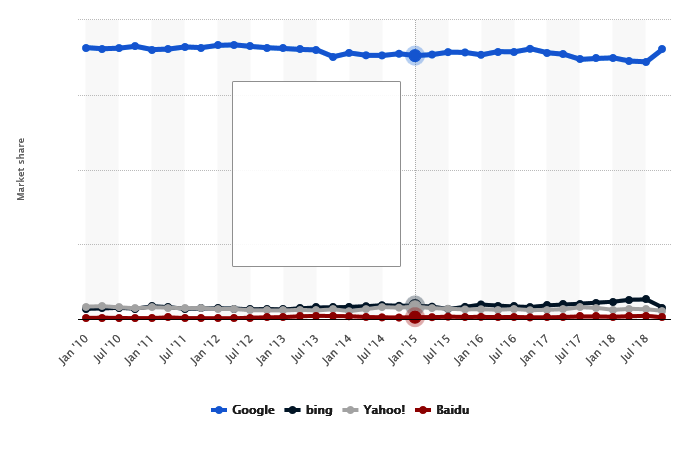
But it’s all in how you make the calculations. At the very same time, Statista was reporting that Google’s worldwide share of desktop search was approximately 89%.

Moreover, Statista’s trend line for Google between 2010 and the end of 2018 is remarkably consistent, with Google’s share of desktop search charting in a narrow range between 86% and 90%:

But I think it’s the data from marketing intelligence and analytics firm Jumpshot that gets us closest to what’s actually happening in the world of search. Jumpshot licenses anonymized ClickStream data from hundreds of millions of users.  It finds that ~63% of all online searches are through Google’s “core” function.

But then one needs to factor in additional Google-related search activity that occurs on Google Maps, Google image search and YouTube, which is owned by Google. When those figures are added to the mix, Google’s market share of search is indeed in excess of 90%, with all other players way, way behind.

This graph shows the makeup of Google’s dominant position as compared to its search competitors:

Source: Jumpshot (based on ClickStream data), 2018.

These dynamics explain why Google remains so entrenched – and why advertisers continue to devote so much of their search engineering advertising dollars to Google properties.

A “constant” in Google’s market strategy over the years has been to make it easy and effortless for users to perform a Google search wherever they are.  In years past, that meant making Google the Home Page on as many Internet browsers a possible. In more recent times it’s taken the form of building activity on Google-centric browsers (Google Chrome), mobile market share (Android), acquiring the dominant video platform (YouTube), and making a major push into voice search with Google Home.

Essentially, wherever someone is … Google is there as well. It’s very much like a commodity or a utility.  (Indeed, its very name has become synonymous with the verb “to search.”)

In case anyone is counting, Google processes an eye-popping 3.5 billion searches per day.  Is it any wonder that any competitor – even a platform like Bing with resources to spend – would have a near-insurmountable challenge getting millions of people to just try a different search option (much less start using it regularly).

Could the situation change?  I suppose nothing is immutable.  The market share figures don’t yet factor in iPhone data at scale.  Some other search product might emerge that is dramatically better-performing than Google.

But none of those factors are likely to change the overall search ecosystem. The fact is, Google dominates search … it has dominated search for years … and it’s on track to continue doing so in the future.

I close with a question to readers. If any of you prefer using a different search product besides Google, please share your reasons why in the comment section below.