Holiday Consumer Spending Forecast Tracks the Economy: Just Muddling Along

The holiday shopping forecast for 2011 is pretty blah.If anyone was hoping for good news at the end of the year, it’s not coming in the form of increased holiday spending by consumers.

The National Retail Federation’s annual Holiday Consumer Intentions & Actions Survey concludes that holiday shoppers plan to spend an average of just over $700 on holiday gifts and seasonal merchandise.

That’s down slightly from last year’s holiday spending plans, which were closer to $720.

The chart below shows how average holiday spending has mirrored general economic conditions in the country over the past eight years:

 2004: ~$700
 2005: ~$735
 2006: ~$751
 2007: ~$755
 2008: ~$694
 2009: ~$681
 2010: ~$719
 2011: ~$704

After having grown to more than $750 in the 2006/07 period, a significant drop-off was seen in 2008 and 2009. With the recession bottoming out, this was followed by a tidy little jump in holiday spending 2010.

But just like the rest of the economic picture, things have stalled since then – or pulled slightly back.

In another recent survey, Ipsos Public Affairs has found that women are more likely than men to be planning to cut back on their holiday shopping outlays … as are people over age 35 compared to younger adults.

With consumers continuing to watch their wallets, it’s no surprise that many are taking advantage of savings opportunities. In the Ipsos survey, half of all respondents reported that they had used magazine coupons within the previous 30 days, and there was significant usage of online savings vehicles as well:

 Magazine or newspaper coupons: ~50% have used in the past 30 days
 Loyalty cards or in-store promos: ~47% have used
 Printable coupons from the web: ~28% have used
 Online “daily deal” coupons: ~27% have used
 Online coupon codes: ~25% have used

Despite the slightly lower figures for intended holiday spending in 2011, the National Retail Federation’s survey finds that nearly 40% of consumers will have already started their holiday shopping in October. A similar 40% plan to start shopping in November, while the remaining 20% won’t begin their shopping activities until September.

[A slim ~4% represent those procrastinators who don’t plan to start any of their shopping until the last two weeks of December; I think most of us all know at least one person who falls into this rarified category.]

And if you’re wondering how the average shopper plans to allocate his or her holiday spending this year, it comes as little surprise that shopping for gifts for children and other family members represents well over half of the value of planned purchases:

 Gifts for children, parents and other family members: ~$403
 Gifts for friends, co-workers and others: ~$112
 Holiday-related food items: ~$97
 Holiday decorations: ~$47
 Greeting cards: ~$27
 Flowers: ~$18

What about you? Do your holiday shopping plans for 2011 mirror what the NRF survey found?

Reading the tea leaves in the U.S. population census results.

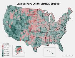
County Population Change: 2000-2010Now that the full scope of information is being released from the latest U.S. population census, many news reports about age demographics tend to focus on the composition of families in urban areaa … the impact of immigration of all stripes … as well as the occasional article about the phenomenon of large family units in “exotic” places like rural Utah and Idaho.

Most of these news reports give the impression that age demographics are getting younger.

Don’t believe it. Instead, we can turn to the U.S. Bureau of Census’ own figures which tell a different story.

In reality, there are fewer children today in most American neighborhoods. In fact, the share of population under the age of 18 declined in ~95% of the counties since 2000.

The Bureau’s stats also show that the number of American households reporting that they have children under age 18 has remained roughly static (at ~38 million) … even while the country’s total population grew by ~10% over the decade.

As a result, the share of all U.S. households with children is only about 33%, down from ~36% ten years earlier … while the share of the U.S. population under age 18 is 24%, compared to 26% ten years earlier.

These census figures and others have become grist for many researchers in recent months, with a number of intriguing reports being issued. One, released by the Brookings Institution, focuses on the changing nature of Suburban America. Alan Berube, author of the report, notes that there is a continuing blurring of the once-sharp lines that used to demarcate central cities from the suburbs.

Instead, there now appear to be more similarities between cities and their “inner core” suburbs, rather than between inner and outer suburban communities.

Urban development guru Joel Kotkin sees this development in a larger sociological context — noting that people tend to “self-select” where they live based on “like” characteristics that go beyond mere economic elements to also include psychographic aspects.

In Kotkin’s view, that trend has contributed to the vast differences we see in political and voting behavior in cities, the suburbs, and exurbs. We may have much less overt segregation based on race or ethnic background … but it’s been replaced by a self-segregation based on perspectives and attitudes.

No wonder it seems that people are “talking past each other” — rather than engaging one another — in our national dialogue about the economy and the government’s proper role in guiding it.

Don’t look for this dynamic to change anytime soon.

Move over, energy costs … Here come higher food prices.

Higher food prices like higher energy pricesIf it seems as if food prices have been increasing at a faster clip in recent months, you’re not dreaming.

Despite an overall inflation rate that seems low (although the federal government’s controversial exclusion of certain key components like gasoline makes its stats suspicious at best), we now have solid evidence that worldwide food cost increases are happening across the board.

Here’s a list of some of the most dramatic cost increases for key foodstuffs recorded since May 2010:

 Coconut oil: +134%
 Corn/maize: +111%
 Wheat: +75%
 Coffee: +70%
 Sugar: +55%
 Soybeans: +45%
 Palm oil: +42%
 Orange juice: +35%
 Beef and pork: +20%

Considering that this represents a time period of just a little over a year, these increases are some the largest recorded in decades.

What caused it to happen? Poor weather and bad harvests are two of the reasons. But high demand from developing countries – particularly China – is another important factor.

“This is a pretty sustainable increase … A number of factors have been building over time in terms of the commodity increase: world economic growth, rising crude oil prices, increased Chinese import demand have all conspired,” is how Bill Lapp, president of commodity analytical company Advanced Economic Solutions, puts it.

Unfortunately, the problem promises to persist, since many of the items above are ingredients that go into other prepared food items. Initially, packaged food makers that had locked in purchases for some items over certain time periods were able to delay delay passing on cost increases because of those hedges. But the bulk of those contracts have run their course by now.

So, even if commodity prices don’t go any higher, we’re likely to see the ripple effects in pass-along price increases all throughout the “food chain” in the months to come.

This isn’t news anyone wants to hear, considering how fragile (non-existent?) the economic recovery is here in the U.S. and in many other countries as well.

The sober truth is, high food costs coupled with increased energy prices have a chokehold on the world economy that is more consequential than many would care to admit.

Fasten your seatbelts, folks. We may be in for yet another wild ride on the economic roller-coaster …

What do consumers think of America’s corporations?

Corporate Trust ... Corporate ReputationWith the budget negotiations in full swing – and high dudgeon – on Capital Hill, naturally the public’s critical eye is trained on our political figures. And Congress is most assuredly taking a beating in the political polls, with approval ratings plunging astonishly below the 20% figure.

[Of course, is that really so surprising? After all, Congress is pretty evenly matched between the two parties … so partisans see much to criticize on both sides.]

The focus of attention on Washington has taken the spotlight off of corporate America – at least in terms of media attention. But that doesn’t mean that “John Q. Public” is giving companies much of a break.

I’ve blogged before about corporate reputations — most recently commenting on a field survey conducted early this year by Harris Interactive that measured the appeal of 60 of the “most visible” American corporate brands. That survey showed an uptick in positive opinions about those firms when compared to prior-year results.

But a May 2011 survey by GfK Custom Research North America shows otherwise. The findings from GfK’s online field survey of ~1,000 U.S. consumers include this doozy: Two-thirds of respondents believe that it’s harder today for American companies to be trusted than it was three years ago.

Furthermore, ~55% say it will be harder for companies to gain their trust in the years to come.

What’s bothering people about U.S. corporations? In order of significance, here are the key concerns:

 The perception that CEOs and other senior executives of corporations are overpaid.

 Corruption in senior management circles.

 Companies make up lost earnings at the expense of their customers.

 More products than ever are being manufactured overseas.

Interestingly, there’s less concern about declining product or service quality as a reason for lower levels of trust. And as has been found in other studies, the public’s view of technology companies is somewhat higher than its trust for companies in other industry segments.

But back to the rather grim overall findings … fewer than one in five survey respondents anticipate that corporate corruption will become better over time – a result that’s substantially lower than what was found in similar field research conducted by GfK a few years ago.

This survey underscores the fact that corporate America has a long way to go to change the sharply negative impressions consumers have of the world of business. Clearly, the financial crisis of 2008 continues to extend its long shadow more than two years later.

And it looms over everyone – public and private sector alike.

This helps explain the generally sour mood people are in these days.

For U.S. Households, the $534,000 Elephant in the Room

It doesn’t matter where you may be on the political spectrum, the most recent financial figures about the U.S. economy and our financial obligations have to be stunning in their import.

It turns out that the federal government’s financial condition has deteriorated much more rapidly and significantly than is commonly understood – far more than the ~1.5 trillion in new debt that was incurred to finance the budget deficit.

Instead, USA Today is reporting that the government took on some $5.3 trillion in new financial obligations during 2010. Not surprisingly, a big chunk of these unmet obligations fell under Medicare and Social Security.

Adding these new obligations to the existing ones translates into a record of nearly $62 trillion in financial promises not paid for.

And if that particular number isn’t striking enough, perhaps putting it this way will get your attention: It translates into ~$534,000 in unfunded obligations for each individual household in the United States.

In addition to $534,000 being a breathtaking number in and of itself, it represents more than five times what Americans have borrowed for everything else (mortgages, car loans, college loans, etc.).

Now there’s certainly a big difference between the government and the private sector, of course. Corporations would be required to account for these new liabilities when they are taken on – and thereby report big losses to their shareholders. But unlike businesses, Congress can conveniently stave off recording these commitments until it’s ready to write the check. “See no evil … hear no evil …”

And here’s another big difference between the federal government and everyone else: the ability to “manufacture” greenbacks to pay for debt obligations. Whether we call it euphemistically “quantitative easing” or more bluntly “printing money,” that’s a solution that comes dangerously close to the famous quip attributed to H. L. Mencken: “For every problem, there’s a solution that is simple, elegant, and wrong.”

Sheila Weinberg, founder of the Chicago-based Institute for Truth in Accounting advocacy organization, raises another key point: “The [federal] debt only tells us what the government owes to the public. It doesn’t take into account what’s owed to seniors, veterans and retired employees. Without accurate accounting, we can’t make good decisions.” She has a good point.

The blind leading the deaf: It certainly doesn’t portend well for the future. But there’s always the hope that if we can somehow create robust future annual economic performance in the 4-5% range, we’ll grow our way out of the problem.

We’ll have to see about that.

The “ol’ college try” … Not good enough anymore?

The questionable college degree ... along with crushing student debt.I’ve blogged before about the increasing concerns many people have regarding the quality of college education in America. Now, several new data points should make every parent of college-age kids – or children who will be ready for college soon – take additional notice.

The first interesting news tidbit is that total student debt, which surpassed the country’s credit card debt for the first time in August 2010, now tops $1 trillion. Compare that to student debt being only around $200 billion as late as 2000.

So we’re talking an increase of ~400% in a little over a decade, which is miles more than the inflation rate over this period. Average debt now stands at almost $23,000 per student, which is a spike of ~8% over the past year alone.

And just what are students getting for all the money they’re spending (or borrowing) for their higher education? If you want to know the ugly truth, check out the recently published book Academically Adrift by sociologists Josipa Roksa and Richard Arum [ISBN-13: 978-0226028569 … also available in a Kindle edition].

Based on the information presented in this book, some grads might wish to haul their colleges up on charges of educational malpractice. Full-time instructional faculty has declined from 78% of college teachers in 1970 to only around 50% today.

Roksa and Arum also report that college faculty members spend, on average, just 11 hours per week on instructional preparation and delivery … the rest of their time is spent on research and a slew of administrative activities.

And how about the “quality” of the education that’s being delivered? If we wish to view that in terms of the amount of time students are spending on their studies, the stats aren’t trending in the right direction. The book claims that whereas the typical college student in the early 1960s devoted an average of 40 hours each week to academic work, today’s students now spend only about 27 hours per week on studies. So in what way is the substantial extra money being extracted from students being used to delier a better quality product?

Here’s the next shocker: ~85% of college graduates are moving back home following graduation. This information comes from a 2011 field survey conducted by Philadelphia-based market research firm Twentysomething, Inc. Compared to the firm’s prior surveys, that represents a spike of nearly 20 percentage points in only five years.

Of course, we all know the economy has been a major problem over the past few years, with jobs hard to come by even for seasoned workers. But to learn that fewer than one in six college students are moving out on their own following college graduation means that precious few grads are coming out of school with the ability to land jobs that can sustain an independent lifestyle — however modest.

With stats as dismal as these, is it any wonder why some people are seeking an alternative paradigm for higher education other than the “four years away from home” model? Enrollment figures at America’s community colleges have been skyrocketing. Online education is also booming, despite lingering concerns about learning standards and accreditation.

Some economists such as Richard Vedder are suggesting making radical reforms in the way that financial aid is provided – and to whom – while other observers are pushing for more recognition of learning credentials that take us beyond a BS or BA degree.

Many of these ideas strike at the very heart of what we’ve always been conditioned to believe about a four-year college education as the gateway to a better life. But with today’s reality being so far removed from the theory (fantasy?) … some out-of-the-box ideas and approaches are exactly what are needed now.

What’s the Latest with Employee Satisfaction?

Coming off the worst recession in memory, just how happy are Americans in their jobs today?

An online survey of ~450 American adults conducted in late February by enterprise feedback management and research firm MarketTools has found that only ~34% consider themselves “very satisfied” in their current job positions:

 Very satisfied: ~34%
 Somewhat satisfied: ~40%
 Neither satisfied nor dissatisfied: ~10%
 Somewhat dissatisfied: ~10%
 Very dissatisfied: ~5%

Those results would seem to portend that a significant number of people will be looking to change jobs in the near-term future.

And in fact, nearly 50% of these respondents reported that they’ve “considered” leaving their current positions – and more than 20% have actually applied for another job within the past six months.

What’s causing dissatisfaction among employees? They’re the usual things, beginning with salary, although many respondents cited multiple contributing factors to employee dissatisfaction:

 Salary level: ~47% of respondents
 Level of workload: ~24%
 Lack of opportunity for advancement / career development: ~21%
 Relationship with manager / supervisor: ~21%
 Medical benefits issues: ~20%
 Work environment: ~14%
 Length of commute / distance from home: ~14%

It shouldn’t be too surprising to witness an increase in job-hopping behavior following economic downturns. For those lucky enough to have held onto their positions during the recession, the working environment has likely been more stressful, as employers required more productivity from fewer workers.

It’s also likely that benefits packages were reduced to some degree. So it’s only natural for people to nurse some residual negative feelings about the situation and to possibly consider jumping ship to another employer.

But would that be the best move?

Often, moving to a new employer doesn’t result in the improvements the employee expected to find. And smarter companies will use the improving economic climate (such as it is) to reward those employees who hung in there when times were tough. After all, these are their better workers!

Salary and benefit increases are always going to be appreciated … but so is the opportunity for continued growth and career development.

It’ll be quite interesting to see what the job-hopping statistics show a few months from now.

Valentine’s Day Spending: All Hearts and Flowers?

Valentine's Day is hearts and dollarsWith the recession finally receding, are we now seeing an uptick in spending for Valentine’s Day — arguably the most romantic day on the calendar?

According to a January Consumer Intentions & Actions questionnaire conducted among ~8,900 participants for the National Retail Federation by survey firm BIGresearch, American adults over age 18 will spend an average of ~$115 on traditional Valentine’s Day merchandise this year. That’s up more than 11% over 2010, and collectively represents spending of nearly $17 billion.

But we have yet to return to the levels of Valentine’s Day spending that were reached in 2007 and 2008 – the highest on record.

Jewelry appears to be the big item on the Valentine’s Day shopping list. Approximately $3.5 billion is expected to be spent in this segment this year, which is up more than 15% from the ~$3.0 billion spent in 2010.

Dining out is another popular category, but its growth is not expected to be nearly as big as jewelry’s – just 3%. The six most popular categories as determined in the NRF study include:

 Jewelry: $3.5 billion
 Dining out: $3.3 billion
 Flowers: $1.7 billion
 Clothing: $1.6 billion
 Candy: $1.5 billion
 Greeting cards: $1.1 billion

[I was surprised at the greeting cards figure. True, cards are a lower-price item compared to the other categories, but the number still seemed pretty meager. It turns out that only about half of the consumers surveyed reported that they planned on purchasing a Valentine’s card, which was lower than I thought would be the case.]

Not surprisingly, younger adults (age 25-34) are expected to spend significantly more than their older counterparts. They’re projected to spend an average of nearly $190 on Valentine’s Day merchandise compared to only about $60 spent by adults over 65.

But it’s not just because of “sweet, fresh young love” versus “tired, worn-out old love.” It’s because young couples and young parents are often buying not only for each other, but also for their co-workers … their children … their children’s friends … and their children’s teachers as well.

And here’s another statistic that won’t surprise very many people: Women will receive Valentine’s Day gifts averaging around $160, which is double the value of gifts for men.

Now, that’s a dynamic that’s likely never changed … and probably never will!

The Limits of Delivering “Cheaper Value”

Nano vehicle

Tata Nano car on fire
Tata Nano ... Tata "No-No"?
About a year ago, the international press was abuzz about the latest new “value” entry in the automobile business. Amid great fanfare, Tata Motors, part of India’s largest corporate conglomerate, was introducing the “Nano,” a car designed to appeal to India’s mass market.

The Nano, which can seat five people and has a surprisingly roomy interior for its size, carries a base price of only ~$2,200 — lower than any other car in the world — which proved irresistible to families of modest means whose finances had required that they make do with motorcycles or scooters before.

Some 9,000 Nano vehicles were delivered in July, but since then, sales have slowed dramatically – to just around 500 shipments to dealers in November.

How did Nano’s star fall so far, so fast – especially for a vehicle which Tata Motors thought was impressive enough that it planned to introduce it in other developing markets … then Europe … and finally to the United States?

Production delays have something to do with it. But the real problem is the performance of the car. Most alarming are reports that the vehicle can catch on fire, with one widely broadcast incident where a Nano caught on fire and was engulfed by flames on the way home from the auto showroom!

In response, Tata, while denying anything is wrong with the design of the Nano and studiously avoiding any language of “recall,” is offering to retrofit the automobile with extra safety features. It’s also extending the warranty on the car from 18 months to a solid four years.

Will these moves change the impression that the car is more of a “No-No” rather than a “Nano” and move its sales trajectory back into positive territory? Perhaps. But it’s interesting to note that sales of a rival “value” car made by Suzuki – the “Alto” – have now overtaken those of the Nano. The Alto carries a higher base price of $6,200, and yet it posted unit sales of ~30,000 in November, making it India’s best-selling car that month.

[The success of the Suzuki Alto in India is nice news for a company whose cars in the U.S. have been on a downward plunge all this year – with sales off ~42% in 2010 compared to 2009.]

The experience of the Nano and the Alto in India brings up an interesting question: Is it possible to make small, cheap version of products that are significant purchase items and win the confidence of a broad customer base?

To a degree, yes. But there are limits to “how low you can go” in value-engineering a product for performance and safety, below which customers just turn and walk away. (Or, in this case, drive away.)

Moreover, just like the experience of the Yugo or the Trabant, there’s a risk of forming a poor market image that’s impossible to shake off.

And in this particular case, the brand names don’t help at all. It’s just too easy for disgusted consumers to say “Ta-Ta” to Tata Motors and “No-No” to the Nano.

Pew Chronicles the Public’s Knowledge of Current Events: A Mile Wide and an Inch Deep

NewsIQ Research from the Pew Research CenterAll right, folks. Are you prepared to be depressed?

The Pew Research Center for People and the Press has just published the results of its annual News IQ survey in which it asks members of the U.S. public a baker’s dozen questions about current events.

A total of ~1,000 people were surveyed by the Pew Research Center in mid-November. The multiple choice survey covered a mix of political, economic and business issues and included the questions shown below. (The percentages refer to how many answered each multiple choice question correctly).

 The company running the oil well that exploded in the Gulf of Mexico (BP) … 88% answered correctly
 The U.S. deficit compared to the 1990s (larger) … 77% correct
 The political party that won the 2010 midterm elections (Republicans) … 75% correct
 The international trade balance (U.S. buys more than it sells) … 64% correct
 The current U.S. unemployment rate (10%) … 53% correct

 The political party that will control the House of Representatives in 2011 (Republicans) … 46% correct
 The state of Indian/Pakistani relations (unfriendly) … 41% correct
 The category on which the U.S. Government spends the most dollars (defense) … 39% correct
 The name of the new Speaker of the House (John Boehner) … 38% correct
 The name of Google’s mobile phone software (Android) … 26% correct

 The amount of TARP loans repaid (more than 50%) … 16% correct
 The name of the new Prime Minister of Great Britain (David Cameron) … 15% correct
 The current U.S. annual inflation rate (1%) … 14% correct

The percentage of respondents who answered all questions correctly was … fewer than 1%. Ten questions? … just 6% answered correctly. Eight of the questions? … only 22%.

On average, respondents answered just five of the 13 questions correctly. Even college graduates scored relatively weak, with an average of just seven questions answered correctly.

The public appears to be best informed on basic economic issues such as the unemployment rate and the budget deficit, while nine in ten respondents correctly identified BP as the corporate culprit in the Gulf of Mexico oil spill event. Not surprisingly, these were among the biggest news stories of the past several quarterly news cycles.

The worst scores were recorded on the TARP program and the current inflation rate, which fewer than one in five respondents answered correctly (about the same as the David Cameron/UK question which people could be forgiven for answering incorrectly).

You can view detailed results from the survey, including breakouts by age, gender, race and political party affiliation. Not wishing to step into a thicket by editorializing on these differences, I’ll leave it to you to see for yourself by clicking through to the Pew findings on your own.

Pew concludes that while Americans are aware of “basic facts” regarding current events, they struggle with getting a good handle on the specifics.

Might this be a byproduct of how people are consuming news these days? After all, there’s far less reliance on newspapers or news magazine articles … and more emphasis on “headline news” and short sound bites.

That’s the sort of recipe that results in people knowing the gist of a story without gaining any particular depth of understanding beyond the headlines.

Now that you’ve seen the correct answers to the questions, you won’t be able to test yourself against the public at large, so I’ve kind of spoiled the fun. But a little honesty here: how well do you think you would have scored?