Where Robots Are Getting Ready to Run the Show

The Brookings Institution has just published a fascinating map that tells us a good deal about what is happening with American manufacturing today.

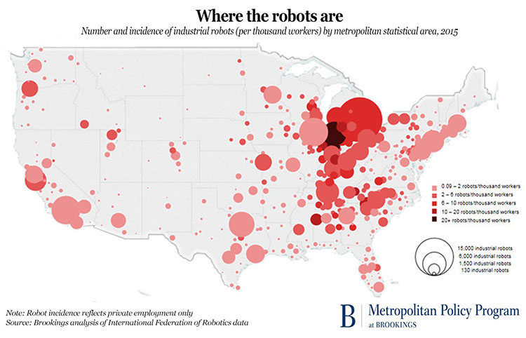
Headlined “Where the Robots Are,” the map graphically illustrates that as of 2015, nearly one-third of America’s 233,000+ industrial robots are being put to use in just three states:

  • Michigan: ~12% of all industrial robots working in the United States
  • Ohio: ~9%
  • Indiana: ~8%

It isn’t surprising that these three states correlate with the historic heart of the automotive industry in America.

Not coincidentally, those same states also registered a massive lurch towards the political part of the candidate in the 2016 U.S. presidential election who spoke most vociferously about the loss of American manufacturing jobs.

The Brookings map, which plots industrial robot density per 1,000 workers, shows that robots are being used throughout the country, but that the Great Lakes Region is home to the highest density of them.

Toledo, OH has the honor of being the “Top 100” metro area with the highest distribution of industrial robots: nine per 1,000 workers.  To make it to the top of the list, Toledo’s robot volume jumped from around 700 units in 2010 to nearly 2,400 in 2015, representing an average increase of nearly 30% each year.

For the record, here are the Top 10 metropolitan markets among the 100 largest, ranked in terms of their industrial robot exposure.  They’re mid-continent markets all:

  • Toledo, OH: 9.0 industrial robots per 1,000 workers
  • Detroit, MI: 8.5
  • Grand Rapids, MI: 6.3
  • Louisville, KY: 5.1
  • Nashville, TN: 4.8
  • Youngstown-Warren, OH: 4.5
  • Jackson, MS: 4.3
  • Greenville, SC: 4.2
  • Ogden, UT: 4.2
  • Knoxville, TN: 3.7

In terms of where industrial robots are very low to practically non-existent within the largest American metropolitan markets, look to the coasts:

  • Ft. Myers, FL: 0.2 industrial robots per 1,000 workers
  • Honolulu, HI: 0.2
  • Las Vegas, NV: 0.2
  • Washington, DC: 0.3
  • Jacksonville, FL: 0.4
  • Miami, FL: 0.4
  • Richmond, VA: 0.4
  • New Orleans, LA: 0.5
  • New York, NY: 0.5
  • Orlando, FL: 0.5

When one consider that the automotive industry is the biggest user of industrial robots – the International Federation of Robotics estimates that the industry accounts for nearly 40% of all industrial robots in use worldwide – it’s obvious how the Midwest region could end up being the epicenter of robotic manufacturing activity in the United States.

It should come as no surprise, either, that investments in robots are continuing to grow. The Boston Consulting Group has concluded that a robot typically costs only about one-third as much to “employ” as a human worker who is doing the same job tasks.

In another decade or so, the cost disparity will likely be much greater.

On the other hand, two MIT economists maintain that the impact of industrial robots on the volume of available jobs isn’t nearly as dire as many people might think. According to Daron Acemoglu and Pascual Restrepo:

“Indicators of automation (non-robot IT investment) are positively correlated or neutral with regard to employment. So even if robots displace some jobs in a given commuting zone, other automation (which presumably dwarfs robot automation in the scale of investment) creates many more jobs.”

What do you think? Are Messrs. Acemoglu and Restrepo on point here – or are they off by miles?  Please share your thoughts with other readers.

For job seekers in America, the compass points south and west.

Downtown Miami

Many factors go into determining what may be the best cities for job seekers to find employment. There are any number of measures – not least qualitative ones such as where friends and family members reside, and what kind of family safety net exists.

But there are other measures, too – factors that are a little easier to apply across all workers:

  • How favorable is the local labor market to job seekers?
  • What are salary levels after adjusting for cost-of-living factors?
  • What is the “work-life” balance that the community offers?
  • What are the prospects for job security and advancement opportunities?

Seeking to find clues as to which metro areas represent the best environments for job seekers, job posting website Indeed set about analyzing data gathered from respondents who live in the 50 largest metro areas on the Indeed review database.

Indeed’s research methodology is explained here. Its analysis began by posing the four questions above and applying a percentile score for each one based on the feedback it received, followed by additional analytical calculations to come up with a consolidated score for each of the 50 metro areas.

The resulting list shows a definite skew towards the south and west. In order of rank, here are the ten metro areas that scored as the most attractive places for job seekers:

#1. Miami, FL

#2. Orlando, FL

#3. Raleigh, NC

#4. Austin, TX

#5. Sacramento, CA

#6. San Jose, CA

#7. Jacksonville, FL

#8. San Diego, CA

#9. Houston, TX

#10. Memphis, TN

Not all metro areas ranked equally strongly across the four measurement categories. Overall leader Miami scored very highly for work-life-balance as well as job security and advancement, but its cost-of-living factors were decidedly less impressive.

“Where are cities in the Northeast and the Midwest?”, you might ask. Not only are they nowhere to be found in the Top 10, they aren’t in the second group of ten in Indeed’s ranking, either:

#11. Las Vegas, NV

#12. San Francisco, CA

#13. Riverside, CA

#14. Atlanta, GA

#15. Los Angeles, CA

#16. San Antonio, TX

#17. Seattle, WA

#18. Hartford, CT

#19. Charlotte, NC

#20. Tampa, FL

… except for one: Hartford (#18 on Indeed’s list).

Likely, the scarcity of Northeastern and Midwestern cities correlates with the loss of manufacturing jobs, which have typically been so important to those metro areas.  Many of these markets have struggled to become more diversified.

If there are similar characteristics between the top-scoring cities beside geography, it’s that they’re high-tech bastions, highly diversified economies or – very significantly – the seat of state government.

In fact, if you look at the Top 10 metro areas, three of them are state capital cities; in the next group, there are two more.  Not surprisingly, those cities were ranked higher than others for job security.  And salary levels compared to the cost of living in those areas were also quite lucrative.

So much for the adage that a government paycheck is low but the job security is high; it turns out, they both are.

For more details on the Indeed listing, how the ranking was derived, and individual scores by metro area for the four criteria shown above, click here.

A Generational Shift within the American Workforce

bmI’ve blogged before about the cultural differences between older and younger Americans in the workforce. Some observers consider the differences to be of historic significance compared to previous eras, due to the confluence of various “macro” forces driving change at an extraordinary pace.

And somewhere along the way when few were looking, the millennial generation has now become the largest cohort in the American workforce.

And it isn’t even a close call: As of this year, millennials make up nearly 45% of all American workers, whereas baby boomer generation now comprises just over a quarter of the workforce.

According to a new report by management training and consulting firm RainmakerThinking titled The Great Generational Shift, there are actually seven groups of people currently in the workplace at this moment in time:

  • Pre-Baby Boomers (born before 1946): ~1% of the American workforce
  • Baby Boomers first wave (born 1946-1954): ~11%
  • Baby Boomers second wave (born 1955-1964): ~16%
  • GenXers (born 1965-1977): ~27%
  • Millennials first wave (born 1978-1989): ~27%
  • Millennials second wave (born 1990-2000): ~17%
  • Post-Millennials (born after 2000): ~1%

roowPersonally, I don’t know anyone born before 1946 who is still in the workforce, but there are undoubtedly a few of them — one out of every 100, to be precise.

But the older members of the Baby Boomer generation are fast cycling out of the workforce as well, with more than 10,000 of them turning 70 years old every day.

By the year 2020, the “first wave” Boomers are expected to be only around 6% of the workforce.  Meanwhile, Millennials are on track to represent more than 50% of the workforce by 2020.

Now, that makes some of us feel old!

The Great Generational Shift report can be downloaded here.

Vacationing Americans and the “Work Martyr Complex”

American workers on vacationI’ve blogged before about the propensity for Americans to forego using all of their allotted vacation time in a given year.

But that was back in 2012, in the waning months of the “Great Recession,” so perhaps one reason for those dynamics was leaner workforces and the need for “all hands on deck.”

A few years have gone by since then, and … very little has changed in these dynamics.

That’s the conclusion in a report released this week by the U.S. Travel Association.  Titled “Overwhelmed America: Why Don’t We Use Our Paid Time Off?”, the study included a survey of ~1,300 American workers and senior business leaders, conducted by GfK.

What the survey found was that 40% of workers fail to take all of their allotted paid time-off.

When asked why this was the case, look at the reasons that were cited:

  • Taking time off will cause my work to pile up: ~40% cited
  • Nobody else can do my job while I’m on vacation: ~35%
  • I can’t afford to take time off:  ~33%
  • I don’t want to be seen as “replaceable”: ~22%

The study characterizes the atmospherics surrounding the phemonemon as a “work martyr complex.”

As U.S. Travel’s chief executive puts it, “busyness” is something Americans wear as a “badge of honor.”

But there may be a bit more to it than that.

The survey also found that two-thirds of the respondents feel that their employer sends mixed messages about taking vacation … says nothing at all about it … or actually discourages people from taking paid time off.

What appears to motivate workers to take their full allotted vacation time is the implementation of “use it or lose it” policies.  When such policies are in place, ~84% of workers take all of their allotted time.

By contrast, for companies that offer the ability for workers to roll over vacation time, bank it, or be paid for time not taken, only about half of their employees (~48%) use all of their time.

The big question is whether most companies truly buy into the notion that taking vacation time is important for overall employee health, well-being and relationships – because the survey found that only a distinct minority of companies (one in four) maintain a “use it or lose it” PTO policy.

Of course, the members of the U.S. Travel Association would certainly benefit if more Americans took paid time off and used it to travel to vacation destinations.   Still, Roger Dow’s contention that “it’s time to start a conversation and reclaim the benefits we work so hard to earn” makes sense to me.  The full report can be viewed here.

At our company, we’ve a “use it or lose it” PTO policy in place for years.  What’s your own situation?

Your declining retirement savings: It’s all relative.

EBRI's Annual Retirement Confidence Survey
The EBRI's 2010 Retirement Confidence Survey reveals severe challenges faced by many American workers.
As difficult as the last two years have been on your finances, you’ve probably saved a lot more for retirement than your fellow workers.

How is that possible? Because it’s all relative. The Employee Benefit Research Institute’s most recent annual survey of U.S. workers and their retirement savings reveals that the percentage of workers having fewer than $10,000 in savings stands at 43%. That’s up from 39% in 2009.

Even more ominous, the percentage of workers who reported they have less than $1,000 in savings is 27% — significantly more than the 20% reported in 2009.

The EBRI’s definition of retirement savings excludes the value of primary homes and defined-benefit pension plans. Still, these are startling figures, showing that large numbers of Americans have little if anything in the way of a savings safety net.

It’s true that some people have plowed their savings into the purchase of a home. But these “house poor” individuals are often among the first who face mortgage foreclosures upon the loss of a job, because they have so few cash resources upon which to fall back.

If there is a glimmer of good news in these dreary statistics, it’s that more people are awakening to the reality of their finances. Gone is the notion that Social Security will pay enough for a decent retirement lifestyle. Indeed, less than 20% of respondents expressed confidence in their ability to save enough for a comfortable retirement. That’s the second lowest reading ever recorded in the 20-year history of the EBRI’s annual survey.

Only ~45% of workers with some form of savings have more than $25,000 stashed away … and people know that $25,000 is not nearly enough for retirement, Social Security payments being what they are. Consequently, in the 2010 EBRI survey, one in four workers report that they’ve decided to postpone their retirements (that’s up from ~15% saying so in the 2009 EBRI research).

For its survey, the Employee Benefit Research Institute queried ~1,150 U.S. workers (age 25 and older) plus retirees, making it one of the most comprehensive field studies on the topic of U.S. retirement savings. There’s a wealth of additional statistics and insights available here.