Ad fraud is quite a large issue for online advertisers – and it’s been on many companies’ radar screens for a long time.
But even with the higher visibility and greater scrutiny of online ad fraud, it seems to be a problem that only gets bigger.
The most recent example of the phenomenon came to light a few weeks ago, when ad fraud prevention consulting firm Pixalate announced that a newly discovered botnet has been draining literally billions of dollars from advertisers’ MarComm coffers.
The botnet is dubbed Xindi – the same name as the hostile aliens in the Star Trek sci-fi TV series.
Xindi is making money for its creators by serving actual ads – but to simulated audiences. It has spread via familiar methods such as phishing.
Pixalate estimates that just shy of 78 billion fake ad impressions have been racked up so far. Even at low cost-per-impression revenue figures, the high volume amounts to several billions of dollars of illicit revenues siphoned (and counting).
What makes the Xindi botnet particularly nettlesome is that it’s designed to go after computers and networks at high-end organizations, enabling it to “mimic” desirable web traffic (i.e. affluent consumers).
According to Pixalate, already there could be as many as 8 million computers compromised in more than 5,000 networks, including a goodly number of Fortune 500 companies as well as university and governmental networks.
Such desirable locations and ad audiences translate into lucrative online ad pricing (CPMs of $200 or more).
In the event, advertisers are paying high prices … for nothing.
To counteract Xindi, Pixalate recommends that the Internet Advertising Bureau update its protocols to factor in the pace of ad requests, so that impression generated after a certain time period cannot be accepted as valid — and hence would be non-billable.
Whether this or other remedies will actually happen is up in the air at the moment (the IAB isn’t onboard with the recommendations).
Either way, what seems clear is that whatever the remedial actions that are taken, burgeoning ad fraud activity is bound to continue.
The question is, can it ever be contained, or will it just continue to grow and grow? If you have any thoughts or ideas on the challenge, please share them with other readers.
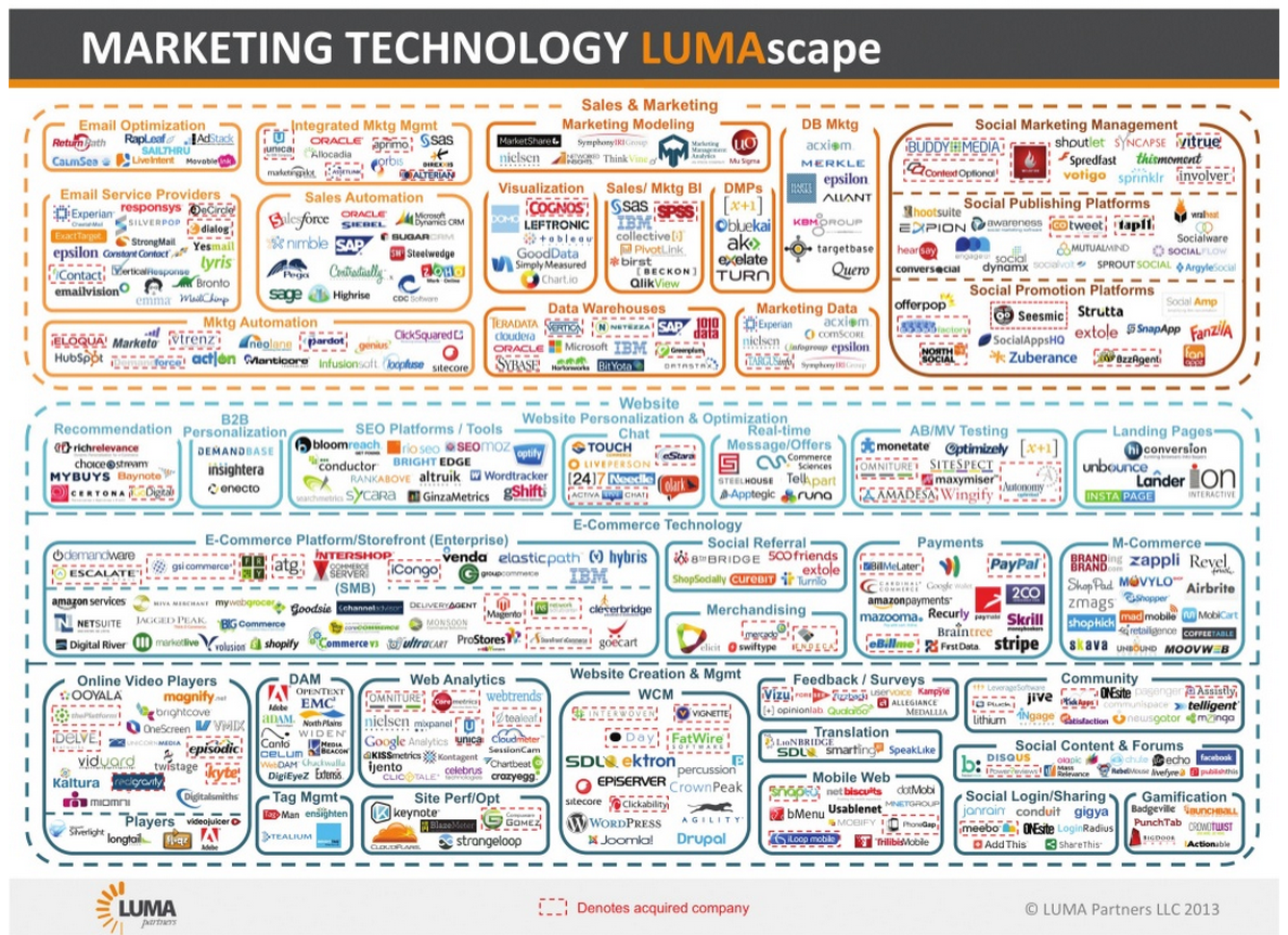
A chart of just some of the major marketing technology platforms — and this was in 2013!
It seems that with each passing day, one or two new technology products are announced by MediaPost and other publishers in the marketing field.
The numbers tell the story. The marketing technology industry website chiefmartec.com lists nearly 1,900 marketing technology vendors in more than 40 categories.
That’s nearly double last year’s tally of around 950 vendors.
Software clearinghouse Capterra lists even more: a whopping 3,000+ marketing technology products across 30 categories.
These firms account for well over $20 billion in financing – the dollars that can be tracked, that is – including around 30 companies that are valued at $1 billion or more each.
That’s a lot of companies and vendors. Of course, there are many customers who are looking for tech-driven marketing solutions as well. The question is whether things have gotten out of balance.
Business writer and marketing tech specialist Malcom Friedberg thinks so. He’s Chief Marketing Officer at CleverTap, and he also publishes columns on a variety of business topics.
In Friedberg’s view, the sheer number of marketing technology vendors and products means that the segment may now be on the brink of an implosion.
Friedman references a recent CMO Council document that reports that more than 80% of marketers are using as many as ten different marketing-related technologies or cloud solutions.
And as new technologies are added, the problem is finding educated staff – and enough hours in the day – to cover all of these products well. In many instances, users may be just scratching the surface of what these products can provide; the “multiple hat” dynamics of many marketing departments mean that very few people qualify as being “advanced” users.
The problems boil down to this: Even if a department has two or three marketing people devoted exclusively to tech-related responsibilities (at tall order in most companies) – this assumes that those people can work equally well on multiple different platforms.
The reality is quite different. It’s more like a big jumble – with consultants brought in to sort things out. It may get the job done, but it isn’t pretty – and it’s hardly a recipe for “the best of best practices.”
Survey work by the CMO Council supports this hypothesis. The Council has found that fewer than on in ten of the marketers it surveyed reported that they possess a highly evolved digital marketing model that has a proven, clear path of evolution.
Malcolm Friedberg
Friedman thinks he knows where things are heading. Not to more choices, but rather to less:
“In my opinion, we’ll start to see massive consolidation and uber-marketing systems. Think super-integrated marketing and advertising clouds … the preoccupation with ‘best-of-breed’ in every category will be replaced by a ‘tree-and-branch’ model, with one core technology and a few ‘good enough’ complementary ones.”
Friedman calls it “an expensive French meal” instead of “a Vegas buffet.” While there will always be new products promising incremental improvements, he predicts that by 2020, the common business model will be super-integrated marketing and advertising clouds as we see already with the likes of Marketo and Hubspot.
What do you think? Is Friedman onto something … or is the orgy of new marketing technology products going to continue unabated? Please share your thoughts with other viewers here.
Quirk’s Marketing Research Review is a periodical I’ve enjoyed reading for three decades or more. Unlike the articles that appear in other research-related publications that are more “scholarly” and theoretical, I find the articles in Quirk’s to be chockfull of insights, while at the same time being “efficiently practical” and easy to digest.
Recently, the magazine published findings from its second annual Quirk’s Corporate Research Report, designed to give corporate researchers an in-depth look into their world.
As part of the research-gathering process for the report, Quirk’s conducted a field survey covering budgets, outsourcing, research techniques in use and under consideration, how research findings are reported inside organizations and, last but not least, the experiences researchers have had when working with outside vendors.
When asked by Quirk’s to state what are the main problem areas when research vendors have come up short on a project, these eight factors were cited by respondents most often:
The vendor over-promised and under-delivered: ~56% of respondents mentioned
The project was handled by low-level staff: ~51%
Vendor failed to take time to understand the client’s business: ~50%
Vendor had poor communications: ~39%
Vendor failed to take time to understand the project’s needs: ~36%
Data integrity issues: ~35%
Vendor missed deadlines: ~35%
Tools/methodologies that the vendor suggested weren’t right for the project: ~14%
Notice how the most pervasive issues have less to do with the inherent quality of the research product being delivered, and more to do with how the vendor interfaces with and communicates with the companies they support.
The above behaviors represent challenges associated with conducting research projects. But I contend that they apply equally well to providers of other types of business and corporate services, whether they’re ERP or IT projects, website development projects, CRM implementation, SEM/SEO programs, media campaigns, PR initiatives … even IPOs, capital campaigns and the like.
Which of these shortcomings do you find to be most prevalent in your dealings with outside service providers — and what have you done about them? Please share any insights you may have with other readers here.
One of the benefits of digital marketing is that there’s no dearth of data pertaining to the deliverability rates of “marketing” e-mail messages.
That’s the good news. The not-so-good news is that those deliverability rates are dropping in nearly every geographic and industry category.
Those are the key takeaway findings in the new global figures released by Return Path in its 2015 Deliverability Benchmark Report. This year, e-mail deliverability rates are sitting at approximately 79%, meaning that around one in five e-mails are not reaching their intended recipients. (Both spam trap e-mails and missing e-mails are included in the stats.)
More troubling is the trend line. In 2014, only 17% of e-mails failed to reach their intended recipients.
The Return Path statistics are particularly important because of the sheer size of the analysis it conducted. The 2015 report analyzed inbox placement statistics by country and industry in addition to e-mail provider, based on a representative sample of the ~357 million e-mail marketing messages tracked by Return Mail and involving ~150 mailbox providers. The evaluation covered permission-based e-mail messages sent between May 2015 and April 2015.
In the United States, deliverability rates are faring worse than elsewhere. It experienced one of the sharpest declines in deliverability, going from 87% in 2014 down to 76% this year.
Most other countries experienced declines as well — just not the same degree. They include Australia, Canada, France, Germany and the United Kingdom.
Only Italy and Brazil saw increased deliverability percentages (Italy by a little … Brazil by a lot), while Spain’s deliverability rate remained the same (at 76%).
Consumer-type industries tend to have the highest deliverability reporting, according to Return Path (typically 90% or greater). Deliverability is far lower in the industrial, software and technology sectors, with rates hovering in the 45% to 65% range.
What’s behind the decline in e-mail deliverability? The Return Path analysis posits several factors:
The introduction of new spam filtering systems, including those for Yahoo Mail and Gmail.
Increasingly sophisticated algorithms applied based on user behaviors, designed to counterbalance the increased volume of e-mail traffic overall (~16% higher in just the past two years).
Additional findings from the 2015 Return Path evaluation can be reviewed in this summary report, along with a detailed description of the study methodology.
It would be interesting to know if individual companies are experiencing similar trends in their own e-marketing programs. If anyone has particular perspectives to share, please do so for the benefit of other readers.
Here’s an interesting factoid: In 2014, more than 550 million blog posts were uploaded on WordPress alone.
Add in Tumblr, and there are another 250 million blogs.
Considering the sheer volume of blogging activity, it’s surprising how little intelligence on the “value” of a blog post has been available. But now a study has been published that sheds light on the question.
The evaluation, which was commissioned by branding agency IZEA and conducted by research firm The Halverson Group, has determined that the lifespan of a blog post is far greater than the accepted measurement of 30 days.
The lifespan is more than 20 times longer, it turns out.
Let’s break down the research findings a bit more. The IZEA/Halverson study determined that by Day 700 (about two years), the typical blog post will have received ~99% of its impressions.
That’s a pretty long annuity, and it provides strong ammo for marketers who advocate for blog posts as an important way to maximize the return on their marketing spend.
According to the study, the typical blog post goes through three distinct phases in its useful life:
Shout: The initial spike in impressions that happens within the first 7 to 10 days, typically resulting in half of the total impressions the post will ever receive.
Echo: The period ending at 30 days, by which time the typical blog post will have racked up ~70% of its total impressions.
Reverb: The third phase that stretches from approximately Day 30 all the way to Day 700. This long-tail phase will typically generate the final ~30% of impressions.
Of course, the performance of individual blog posts will depend on the subject matter, the timeliness of the information, and other factors. But as a general rule of thumb, the Halverson findings show the potential value of a blog post as far greater than many marketers may have surmised up until now.
The Halverson study also provides a good rule of thumb for the lifetime impression value of a blog post. It can be calculated by multiplying a blog post’s 30-day monthly pageview total by a factor of 1.4.
In other words, by Day 30, marketers can know with a good deal of confidence how the blog post will perform overall.
Using this formula, marketers will be able to demonstrate the “evergreen” effect of blogging as a marketing tactic.
Certainly, the residual benefits of a blog post look very strong — particularly in contrast to volume-based media such as display or search advertising, which stop performing the instant the campaign investment ends.
The bottom line: Companies should continue to blog away … and if they haven’t started or if they’ve allowed their blogging program to flag, it’s time to get things back in gear!
I’ve blogged recently about the market reception to the Apple Watch, which seemed to be somewhat less “ecstatic” compared with previous Apple product introductions — at least in the first few weeks after its unveiling.
Now we have several months behind us — as well as some field research that suggests that the Apple Watch is being very well-received by early adopters.
The findings come courtesy of a research panel of 145 Apple Watch owners who were contacted in late July and early August 2015 by consumer market research company 451 Research. The research sample was drawn from the company’s ChangeWave network of ~25,000 business and technology professionals.
The overall satisfaction level with the Apple Watch among these respondents is ~83%, with ~54% stating that they are “very satisfied” with the product.
In terms of how well the watch is performing in relation to owners’ expectations, almost the same percentage (~79%) state that the Apple Watch is meeting them.
The three attributes of the Apple Watch that are most well-liked are these:
Notifications/alerts: ~49% mentioned
Health and fitness monitoring: ~41%
Design aesthetics of the product: ~30%
The three concerns about the Apple Watch mentioned most frequently are these:
Not surprisingly, the Apple Watch poses a competitive threat to more traditional digital watches, as more than four in five respondents report that the Apple Watch has replaced the traditional watches if they had worn one earlier. (On the other hand, about one third of owners didn’t wear anything on their wrist at all before acquiring their Apple Watch.)
Fitness monitors: Odd man out?
The popularity of the Apple Watch’s health and fitness monitoring capabilities portends problems for competing monitors as well. Nearly half of the Apple Watch owners surveyed by 451 Research reported that they have previously planned on purchasing a monitor, but have since decided not to, thanks to the Apple Watch’s functionality.
As for whether the Apple Watch is becoming an indispensible part of the fabric of daily life with these users as compared to being more of a novelty gadget, the behavior is looking a lot more like the former:
Use daily for health and fitness monitoring: ~79% of respondents reported
Send and receive text messages daily: ~63%
Check weather information daily: ~52%
Perhaps the best indication of how satisfied these early adopters are with the Apple Watch is how they responded to the question, “Would you recommend the Apple Watch to a friend or colleague?”
The answer? More than four in five respondents (~83%) answered in the affirmative: ~55% reported “very likely” and ~28% reported “somewhat likely.”
If consumer response continues along the same lines in the upcoming months, it may well mean that the Apple Watch is on the path to gaining impressive adoption figures — and proving the naysayers wrong.
The real proof will be in the sales figures, of course. But seeing these indications of early adopters being quite satisfied ith the product’s performance — and willing to recommend it to friends and colleagues — is a very good first step.
If you have begun using an Apple Watch, I’m sure other readers would be interested to know what appeals to you most about it — and what attributes might not be living up your expectations. Please share your experiences here.
It’s human nature for people to strive for the most flattering public persona … while confining the “true reality” only to those who have the opportunity (or misfortune) to see them in their most private moments.
It goes far beyond just the closed doors of a family’s household. I know a recording producer who speaks about having to “wipe the bottoms” of music stars — an unpleasant thought if ever there was one.
In today’s world of interactivity and social platforms, things are amplified even more — and it’s a lot more public.
Accordingly, there are more granular data than ever about people, their interests and their proclivities.
The opportunities for marketers seem almost endless. At last we’re able to go beyond basic demographics and other conventional classifications, to now pinpoint and target marketing messages based on psychographics.
And to do so using the very terms and phrases people are using in their own social interactions.
The problem is … a good deal of social media is one giant head-fake.
Don’t just take my word for it. Consider remarks made recently by Rudi Anggono, one of Google’s senior creative staff leaders. He refers to data collected in the social media space as “a two-faced, insincere, duplicitous, lying sack of sh*t.”
Anggono is talking about information he dubs “declared data.” It isn’t information that’s factual and vetted, but rather data that’s influenced by people’s moods, insecurities, social agenda … and any other set of factors that shape someone’s carefully crafted public image.
In other words, it’s information that’s made up of half-truths.
This is nothing new, actually. It’s been going on forever. Cultural anthropologist Genevieve Bell put her finger on it years ago when she observed that people lie because they want to tell better stories and to project better versions of themselves.
What’s changed in the past decade is social media, of course. What better way to “tell better stories and project better versions of ourselves” than through social media platforms?
Instead of the once-a-year Holiday Letter of yore, any of us can now provide an endless parade of breathless superlatives about our great, wonderful lives and the equally fabulous experiences of our families, children, parents, A-list friends, and whoever else we wish to associate with our excellent selves.
Between Facebook, Instagram, Pinterest and even LinkedIn, reams of granular data are being collected on individuals — data which these platforms then seek to monetize by selling access to advertisers.
In theory, it’s a whole lot better-targeted than the frumpy, old fashioned demographic selects like location, age, income level and ethnicity.
But in reality, the information extracted from social is suspect data.
This has set up a big debate between Google — which promotes its search engine marketing and advertising programs based on the “intent” of people searching for information online — and Facebook and others who are promoting their robust repositories of psychographic and attitudinal data.
There are clear signs that some of the social platforms recognize the drawbacks of the ad programs they’re promoting — to the extent that they’re now trying to convince advertisers that they deserve consideration for search advertising dollars, not just social.
In an article published this week in The Wall Street Journal’s CMO Today blog, Tim Kendall, Pinterest’s head of monetization, contends that far from being merely a place where people connect with friends and family, Pinterest is more like a “catalogue of ideas,” where people “go through the catalogue and do searches.”
Pinterest has every monetary reason to present itself in this manner, of course. According to eMarketer, in 2014 search advertising accounted for more than 45% of all digital ad spending — far more than ad spending on social media.
This year, the projections are for more than $26 billion to be spent on U.S. search ads, compared to only about $10 billion in the social sphere.
The sweet spot, of course, is being able to use declared data in concert with intent and behavior. And that’s why there’s so much effort and energy going into developing improved algorithms for generating data-driven predictive information than can accomplish those twin goals.
Rudi Anggono
In the meantime, Anggono’s admonition about data mined from social media is worth repeating:
“You have to prod, extrapolate, look for the intent, play good-cop/bad-cop, get the full story, get the context, get the real insights. Use all the available analytical tools at your disposal. Or if not, get access to those tools. Only then can you trust this data.”
What are your thoughts? Do you agree with Anggono’s position? Please share your perspectives with other readers here.
Over the years, I’ve noticed how signature blocks at the bottom of business e-mails have been getting longer and more elaborate.
Remember the days of simply showing an office address, phone, FAX and e-mail? That disappeared a long time ago.
Why it’s happened is all a function of the many ways people can and do choose to communicate today.
For folks in the marketing and sales field, sometimes the contact options go overboard. Not long ago, I received an e-mail pertaining to a business service pitch. Here’s what the sender had included in the signature area at the bottom of his e-mail message:
If you’re a phone person, here’s my mobile number:
If you’re a text person, send a message to my cell:
If you’re an email person, here’s my address:
If you’re an instant message person, here’s my Google ID:
If you’re a Skype person, here’s my handle:
If you’re a Twitter person, here’s my username:
If you’re a Facebook person, here’s my page:
If you’re a face-to-face person, here’s my office location:
The only thing missing was Pinterest, and a FAX number …
Seeing this signature block was a stark reminder of the myriad ways people are connecting with their business and personal contacts.
Nothing new in that, of course — but seeing it presented in one big bundle really drove the point home.
Scott Ginsberg
Later, I discovered that this litany of contact options was first popularized four or five years ago by the business author and blogger Scott Ginsberg. Evidently, others have now picked up and run with the same concept.
Taken together, it’s no wonder people feel busier today than ever before, despite all of the ways in which digital technology purports to simplify communication and make it more efficient.
I wouldn’t want to go back to the old days … but at times, there’s a certain attraction to the idea of not having to be “always on” in “so many places,” no?
It’s the strongest signal yet that Google’s vaunted business model is spectacularly successful for its core business … but that it’s as ineffective as most other companies when it comes to building the next silver-bullet product or service.
Even Google’s YouTube business unit is likely only a break-even proposition, despite years of concentrated attention, enhancements and tweaking. According to Morgan Stanley’s Brian Nowak:
“We estimate YouTube runs at a 0% profit margin … YouTube’s profitability could [actually] be lower than we estimate, but since it likely varies significantly from quarter to quarter, and until we have more visibility into the business, we believe break-even is a safe assumption.”
It’s likely we wouldn’t have even these clues were it not for the recently announced creation of Alphabet, a new umbrella structure for Google’s various business segments: search, which is an estimated 96%+ of its business volume, and then everything else.
This development is providing more “transparency” that enables investment houses like Morgan Stanley to come up with back-of-the-napkin rough figures like this:
As time goes on, it will be interesting to see if Alphabet can demonstrate that the corporation is more than a one-trick pony.
Regardless of that outcome, the way that Google has cornered a ginormous $60 billion+ chunk of the advertising business is amazing – and laudable. Fair dues on that.
“I don’t want a ‘relationship’ with my brands. I want the best products at the best price.” — Jane Q. Public
In the era of interactive marketing and social media, there’s often a good deal of talk about how certain brands are successfully engaging their customers and creating an environment of “brand love” — or at least “brand stickiness.”
As a person who’s been involved in marketing and advertising for well over a quarter-century, I tend to treat these pronouncements with a little less open-mouthed awe than others.
I get how when a brand is particularly admired, it becomes the “go-to” one when people are in the market for those particular products and services.
But the idea that there’s real “brand love” going on — in a sense similar to people forging close relationships with the people in their lives — to me that’s more far-fetched.
The marketing research I’ve encountered appears to refute the notion as well.
Case in point: In an annual index of “meaningful brands” published by the Havas MarComm agency, the research finds that very few consumers cite brands they “can’t live without.”
The 2015 edition of the Havas Meaningful Brands Index has now been released … and the results are true to form. Among U.S. consumers, only about 5% of the 1,000 brands evaluated by Havas across a dozen industries would be truly missed if they were no longer available.
It’s a big survey, too: Havas queried ~300,000 people across 34 countries in order to build the 2015 index. Broadly speaking, the strength of brands is higher in countries outside the United States, reflecting the fact that trust levels for leading brands in general are higher elsewhere — very likely because lesser known brands or “generics” have a greater tendency to be subpar in their performance.
But even considering the brand scores globally, three out of four consumers wouldn’t miss any brands if they suddenly disappeared from the market.
What are the exceptions? Looking at the brands that scored highest gives us clues as to what it takes to be a brand that people truly care about in their lives.
Samsung is ranked the #1 brand globally. To me, it makes perfect sense that the manufacturer of the most widely sold mobile device on the planet would generate a strong semblance of “brand love.”
Even in the remotest corners of the world, Samsung has made the lives of countless people easier and better by placing a powerful computer in their pocket. It’s only logical that Samsung is a brand many people would sorely miss if it disappeared tomorrow.
The second strongest brand in the Havis index is Google. No surprise there as well, because Google enables people to research and find answers on pretty much anything that ever crosses their minds. Again, it’s a brand that most people wouldn’t want to do without.
But beyond these, it’s plain to see that nearly all brands just aren’t that consequential to people’s lives.
With this in mind, are companies and brands spending too much energy and resources attempting to get customers to “care” about them more than simply to have a buying preference when the time comes to purchase products and services?
Related to that, is adding more “meaning” to a brand the answer to getting more people to express brand love? Or does it have far more to do with having products that meet a need … work better than competitors’ offerings … and are priced within the means of more people to purchase?
Havas — and common sense — suggests it’s the latter.
Do that stuff right, and a company will earn brand loyalty.
All the rest is just froth on the beer … icing on the cake … good for the psychological bennies.

 Ad fraud is quite a large issue for online advertisers – and it’s been on many companies’ radar screens for a long time.
 According to Pixalate, already there could be as many as 8 million computers compromised in more than 5,000 networks, including a goodly number of Fortune 500 companies as well as university and governmental networks.