Social media data mining: Garbage-in, garbage-out?

gigoIt’s human nature for people to strive for the most flattering public persona … while confining the “true reality” only to those who have the opportunity (or misfortune) to see them in their most private moments.

It goes far beyond just the closed doors of a family’s household. I know a recording producer who speaks about having to “wipe the bottoms” of music stars — an unpleasant thought if ever there was one.

In today’s world of interactivity and social platforms, things are amplified even more — and it’s a lot more public.

Accordingly, there are more granular data than ever about people, their interests and their proclivities.

The opportunities for marketers seem almost endless. At last we’re able to go beyond basic demographics and other conventional classifications, to now pinpoint and target marketing messages based on psychographics.

And to do so using the very terms and phrases people are using in their own social interactions.

The problem is … a good deal of social media is one giant head-fake.

Don’t just take my word for it. Consider remarks made recently by Rudi Anggono, one of Google’s senior creative staff leaders. He refers to data collected in the social media space as “a two-faced, insincere, duplicitous, lying sack of sh*t.”

Anggono is talking about information he dubs “declared data.” It isn’t information that’s factual and vetted, but rather data that’s influenced by people’s moods, insecurities, social agenda … and any other set of factors that shape someone’s carefully crafted public image.

In other words, it’s information that’s made up of half-truths.

This is nothing new, actually. It’s been going on forever.  Cultural anthropologist Genevieve Bell put her finger on it years ago when she observed that people lie because they want to tell better stories and to project better versions of themselves.

What’s changed in the past decade is social media, of course.  What better way to “tell better stories and project better versions of ourselves” than through social media platforms?

Instead of the once-a-year Holiday Letter of yore, any of us can now provide an endless parade of breathless superlatives about our great, wonderful lives and the equally fabulous experiences of our families, children, parents, A-list friends, and whoever else we wish to associate with our excellent selves.

Between Facebook, Instagram, Pinterest and even LinkedIn, reams of granular data are being collected on individuals — data which these platforms then seek to monetize by selling access to advertisers.

In theory, it’s a whole lot better-targeted than the frumpy, old fashioned demographic selects like location, age, income level and ethnicity.

But in reality, the information extracted from social is suspect data.

This has set up a big debate between Google — which promotes its search engine marketing and advertising programs based on the “intent” of people searching for information online — and Facebook and others who are promoting their robust repositories of psychographic and attitudinal data.

There are clear signs that some of the social platforms recognize the drawbacks of the ad programs they’re promoting — to the extent that they’re now trying to convince advertisers that they deserve consideration for search advertising dollars, not just social.

In an article published this week in The Wall Street Journal’s CMO Today blog, Tim Kendall, Pinterest’s head of monetization, contends that far from being merely a place where people connect with friends and family, Pinterest is more like a “catalogue of ideas,” where people “go through the catalogue and do searches.”

Pinterest has every monetary reason to present itself in this manner, of course.  According to eMarketer, in 2014 search advertising accounted for more than 45% of all digital ad spending — far more than ad spending on social media.

This year, the projections are for more than $26 billion to be spent on U.S. search ads, compared to only about $10 billion in the social sphere.

The sweet spot, of course, is being able to use declared data in concert with intent and behavior. And that’s why there’s so much effort and energy going into developing improved algorithms for generating data-driven predictive information than can accomplish those twin goals.

Rudi Anggono
Rudi Anggono

In the meantime, Anggono’s admonition about data mined from social media is worth repeating:

“You have to prod, extrapolate, look for the intent, play good-cop/bad-cop, get the full story, get the context, get the real insights. Use all the available analytical tools at your disposal. Or if not, get access to those tools. Only then can you trust this data.”

What are your thoughts? Do you agree with Anggono’s position? Please share your perspectives with other readers here.

Who Are the “Mobile Addicts” in This World?

phones on paradeMost of us know at least some people who seem to be on their mobile devices constantly. And now their total numbers have been quantified.

Bank of America has teamed up with Yahoo! research firm Flurry Analytics to publish a Consumer Mobility Report. The one published last month is the second such yearly report.

The BofA/Flurry analysis breaks down three categories of mobile device users: those who it characterizes as “regular users” … “super users” … and “mobile addicts.”

The classifications are defined as follows:

  • Regular Users: People who launch mobile applications 1 to 16 times per day
  • Super Users: Those who launch apps 16 to 60 times per day
  • Mobile Addicts: Those who launch apps more than 60 times per day

According to the study, using these criteria there are ~280 million people around the world who qualify as Mobile Addicts — and that figure is up sharply since 2014 (by nearly 60%).

By comparison, Super Users represent slightly under 600 million people, while Regular Users are still the lion’s share at ~985 million.

So, while a distinct minority, the number of Mobile Addicts is actually quite high — and it’s growing much faster than the other two segments.

It certainly helps us understand why we’re seeing mobile addiction-like behavior seemingly everywhere we look.

The BofA/Flurry study also delved into the major categories of apps that Mobile Addicts are using, and found that their usage levels are higher across all of these categories.

The five most popular categories for Mobile Addicts are topped by messaging and social platforms, which represent the biggest usage compared to other mobile phone consumers:

  • Messaging and social index: 556 (used 5.56 times more than the average mobile device consumer)
  • Utilities and productivity index: 427
  • Gaming index: 202
  • Finance index: 155
  • News and magazines index: 102

Study details are available here.

Do any of these statistics come as a particular surprise to you? Let other readers know your thoughts.

Magazine readership preferences confirm the continued primacy of print.

pileIn my line of work, I receive many magazines and other publications covering not only the marketing and advertising field, but also the industries and markets of our corporate clients.

Every time one of these subscriptions comes up for renewal, I’m strongly urged to choose the online/electronic offering instead of the print edition.

I know why, of course. Between the printing, postage and shipping considerations, magazines and other printed media represent the most involved (and the most costly) form of delivery.

And there’s also the issue of “currency” and “recency,” with breaking news being covered much quicker and more efficiently online.

Still, I generally opt for print for the simple reason that a physical magazine, newspaper or newsletter is easier to browse and to read. I like the “linearity” of a print magazine and find magazine reading less satisfactory online.

Don’t get me wrong — I’m very happy digital versions of the print editions exist. I love the fact that I can go online and access an article of particular interest that I may wish to archive in electronic form, or pass along to friends and colleagues.

So, consider me an “all of the above” sort of person. Still, there are times when I think that I represent a more traditional way of thinking about consuming news articles — one that’s decidedly losing popularity.

But then … we see the results of a new digital magazine market study, published by Mequoda Group, a media consulting firm.

The survey, which was conducted in July 2015 among ~3,650 Americans adults age 18 or higher who have access to the Internet, found that digital magazine consumption has now reached ~43% of print magazine consumption.

So digital is rising.

But the Mequoda research also finds that ~70% of American adults who have access to the Internet have read an average of three print magazine issues in the past 30 days. (2.91 print magazine issues, to be precise.)

Here are the findings for print magazines read over the previous month:

  • Read one print magazine: ~18%
  • Read two: ~19%
  • Read three: ~13%
  • Read four: ~8%
  • Read five or more: ~13%

At the same time, ~37% of American adults who have access to the Internet have read an average of 2.37 digital magazine issues over the past month. Here’s how that breakdown looks:

  • Read one digital/online magazine: ~14%
  • Read two: ~8%
  • Read three: ~5%
  • Read four: ~3%
  • Read five or more: ~7%

What this means is that in 2015, print magazine readership activity outnumbers digital by a 2-to-1 margin.

The Mequoda research tested five reasons why people might prefer reading digital versions over printed versions of magazines. Of those who read digital magazines, here are the percentages who deemed those reasons “very important”:

  • Offers immediate delivery: ~42% consider very important
  • Portability / easy to carry: ~40%
  • Environmentally friendly: ~40%
  • Cheaper than print: ~39%
  • Thousands of titles: ~35%

The bottom line on this topic appears to be that the demand for print delivery of periodicals remains significant … and that publishers who elect to shift to “all-digital” delivery stand to lose at least some of their reader engagement.

Even so, I have no doubt that publishers will continue to push electronic delivery in the hopes that print can eventually fall completely by the wayside.

The full report is available free of charge from Mequoda here.

Getting Our “Just Rewards” in Airline and Hotel Loyalty Programs

If you think your airline or hotel rewards program is “merely mediocre” … you’re likely not alone.

Rewards ProgramsU.S. News & World Report’s just-published annual listing of the best and worst rewards programs in the airline and hotel industries is confirming what many people already suspect: some of America’s biggest loyalty programs are also some of the least liked.

Let’s start with the airlines. USN&WR ranked the ten largest programs on a variety of attributes including the ease of redeeming points for free flights and hotel stays.

Best Airline RewardsThe three best performing airline rewards programs do include two with high participation rates — American and Southwest:

  • #1: Alaska Airlines Mileage Plan
  • #2: American Airlines AAdvantage
  • #3: Southwest Rapids Rewards

But three other programs, including two of the biggest ones — United and Delta — bring up the rear:

  • #8: United MileagePlus
  • #9: Delta SkyMiles
  • #10: FREE SPIRIT

Ranked in between are four other airline rewards programs, generally ones with fewer participants because of the smaller size and narrower geographic reach of the airlines involved:

  • #4: JetBlue TrueBlue
  • #5: HawaiianMiles
  • #6: Virgin America Elevate
  • #7: Frontier EarlyReturns

As for which airline rewards programs experienced significant changes in their rankings between this report and last year’s, the biggest shift was JetBlue, which fell from the top-ranked position in 2014 to fourth place in the latest ranking.

Hotel Rewards Programs

Best Hotels RewardsUSN&WR took the same approach with hotel rewards programs, but evaluated a larger group of 18 programs. The five best-ranked hotel programs are the following ones:

  • #1: Marriott Rewards
  • #2: Wyndham Rewards
  • #3 (tie): Best Western Rewards and Club Carlson
  • #5: IHG Rewards Club

Marriott’s top ranking is a repeat from the 2014 USN&WR rankings, and it’s due to maintaining high strength in the three-legged stool of critical factors: having an extensive hotel network; a relatively lower requirement for earning and redeeming free hotel stays; and generous “extras” as part of its membership perks.

Also noteworthy was Wyndham Rewards ascent to the #2 position from #7 a year earlier.  Its dramatic improvement was attributable to changing its program policies to allow members to redeem a night’s hotel stay for a flat rate of 15,000 points across the board.

At the other end of the scale were these low-ranked rewards programs:

  • #14:  Kimpton Karma Rewards
  • #15: Le Club Accorhotels
  • #16: Fairmont President’s Club
  • #17: iPrefer
  • #18: Loews YouFirst

The worst programs score that way because in comparative terms, they lack easy ways to earn points.  Also, in many cases their geographic coverage and/or property diversity is lacking.

[Perhaps the bottom-ranked program will need to change its name to Loews YouLast …]

For the record, the hotel rewards programs that came in the middle of the pack are these:

  • #6: Leaders Club
  • #7: La Quinta Returns
  • #8: Starwood Preferred Guest
  • #9: Hilton HHonors
  • #10: Hyatt Gold Passport
  • #11: Choice Privileges
  • #12: Stash Hotel Rewards
  • #13: Omni Select Guest

More information about the USN&WR rewards program rankings for both industries can be found here.

What about your personal experience with various airline and hotel programs? Do you have one or two particular favorites? Or ones you’ve decided to stay away from at all costs? Please share your perspectives with other readers.

“Harbingers of Failure”: When Early Adopters Spell Doom Rather than Boon for a New Product

shop

There’s an interesting new perspective about certain early adopters of new products:  Rather than being a predictor of success, they could well be a harbinger of failure.

Four researchers – Eric Anderson of Northwestern University along with Duncan Simester, Song Lin and Catherine Tucker from MIT – have come to this conclusion after analyzing actual purchase transaction data collected from consumers.

Their findings were published in the January 2015 edition of the American Marketing Association’s Journal of Marketing Research.

Specifically, the researchers mined a comprehensive dataset of purchase transaction information collected by a large retail chain that sells consumer packaged goods.

What the four researchers discovered was that there are certain customers whose decisions to adopt a new product are a signal that the product will likely fail rather than succeed.

Moreover, their analysis revealed that because these early adopters have preferences that aren’t representative of other consumers in the market, these adoption patterns can be isolated from those of other customers, enabling a company to predict the propensity of a new product to succeed or fail.

These “harbingers of failure,” as the researchers dub them, are consumers who fall into two categories:

  • They purchase products that are “flops” – the ones that end up failing and being removed from the market.
  • They purchase products that, while remaining available in the market, are “niche” offerings that few other customers buy.

Either way, the consumers exhibit purchase behaviors that are an “unrepresentative” subset of purchasers.

The study suggests caution when looking at aggregate positive sales figures in product test markets. Instead of considering sales figures in the aggregate, companies should drill down and study the characteristics of the buyers – whether they are ones who typically back winners or losers.

The report draws ties to several “historical” brand introductions in which purchasers of the Swiffer® mop correlated with Arizona Iced Tea® – both winning product introductions – as compared to purchasers of Diet Crystal Pepsi® and Frito-LayTM Lemonade – both of which bombed.

According to the researchers, the success of the second product (Arizona Iced Tea) could have been foretold by analyzing the sales behavior of the first (Swiffer).

Similarly, the failure of Frito Lay Lemonade could have been foretold by looking at the disappointing sales behavior of the first (Diet Crystal Pepsi).

Because of the extensive database of transactions tied to individuals that is available today thanks to bar-code scanning, loyalty programs and the like, many large consumer product firms have access to a wealth of granular data. The study contends that more people should use these data to improve their share of product introduction successes.

The full report, including research methodology and statistical analysis, can be viewed here.

What’s happening with the Apple Watch these days?

Not all that much, it turns out.

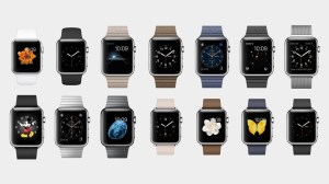
Apple Watch LineWhen is the last time you heard about a product introduction where initial sales were off by 90% barely three months after coming on the market?

If you’re thinking the Blackberry 10 … you’re wrong.

It’s the Apple Watch. Its introduction in April was made with a big amount of fanfare, promoted before and after the launch by PR, TV and online advertising, and even outdoor billboards.

But the hard truth is that aside from the tech community, few people are buying the Apple Watch.

According to Slide Intelligence, weekly Apple Watch sales have plummeted from around 200,000 per day at launch to fewer than 20,000 per day now. Moreover, most sales have been of the least expensive Sport model ($349).

Even worse, of those who have purchased an Apple Watch, fewer than four in ten would recommend the device to others.

You know there’s a problem when a new product engenders ridicule such as this brief, highly dismissive video review.

It may be too soon to write off the Apple Watch introduction as an abject failure. But I know one thing: The market’s (lack of) receptivity so far can’t be what Apple execs were hoping for.

It must be quite a comedown for a company that experienced the dizzying popularity of the iPod, iPhone and iPad right out of the box — and where those product sales continued to climb at an increasing rate for months or years after their debut.

google-glass-fashionSome people are comparing the Apple Watch introduction to what happened to Google Glass – likewise the victim of tepid sales to the point where Google quietly removed the product from the market after making a go of it for about two years.

Actually, I’m not quite sure the comparison is completely apt.

For starters, Google Glass didn’t come on the market backed by a ginormous PR and advertising campaign. In fact, it wasn’t really presented as a full-blown product – but more like a project with a beta test component.

Also, it was never made available in wide release; some people I know who wanted to “kick the tires” with Google Glass had difficulty finding out how they could do so.

But besides the very different rollout strategies, another factor might explain a more fundamental difference – and which has hugely negative potential impact on the Apple Watch.

Whereas Google Glass offered its wearers some truly new functionality, what does the Apple Watch deliver besides being merely a miniature version of an iPhone?

When something is less user-friendly (too miniature for many) … doesn’t offer any new functionality over alternative products … and is pretty expensive to boot, is it any wonder that the Apple Watch’s debut has had all the pizzazz of a cold mashed potato sandwich?

Speaking personally, I don’t consider a multipurpose device about an inch square in size as a “must-have” gadget, and I’m pretty sure others would agree with me.

Technology writer and CRM specialist Gene Marks cautions that the Apple Watch’s future isn’t likely to be much brighter than its less-than-impressive performance to date because of this fundamental liability: “The Apple Watch is not making people or companies quicker, better or wiser,” he contends.

In the world of technology and gadgets, that’s not recipe for success. Just ask Blackberry.

Now … let’s hear from Apple Watch users.  What’s your take?

TV’s Disappearing Act

Television viewing among 18- to 24-year-olds reaches its lowest level yet. 

TV watchingThe latest figures from Nielsen are quite telling:  The decline in TV watching by younger viewers is continuing – and it’s doing so at an accelerating pace.

Looking at year-over-year numbers and taking an average of the four quarters in each year since 2011, we see that the average number of hours younger viewers (age 18-24) spend watching television has been slipping quite dramatically:

  • 2011: ~24.8 hours spent watching TV weekly
  • 2012: ~22.9 hours
  • 2013: ~22.0 hours
  • 2014: ~19.0 hours

It’s nearly a 25% decline over just four years.  More significantly, the most recent yearly decline has been at a much faster clip than Nielsen has recorded before:

  • 2011-12 change: -7.7%
  • 2012-13 change: -3.9%
  • 2013-14 change: -13.6% 

So far this year, the trend doesn’t appear to be changing.  1st quarter figures from Nielsen peg weekly TV viewing by younger viewers at approximately 18 hours.  If this level of decline continues for the balance of the year, watching TV among younger viewers will be off by an even bigger margin than last year.

There’s no question that the “great disappearing television audience” is due mainly because of the younger generation of viewers.  By contrast, people over the age of 50 surveyed by Nielsen watch an average of 47.2 hours of television per week — nearly three times higher.

picLest you think that the time saved by younger viewers is going into outdoor activities or other recreational pursuits and interests, that’s certainly not the case.  They’re spending as much time using digital devices (smartphones, tablets and/or PCs) as they are watching TV.

So, it’s a classic case of shifting within the category (media consumption), rather than moving out of it.

I don’t think very many people are surprised.

Copywriting by computer: Wave of the future? … or wild-ass pipe dream?

persado logoIn recent years, computers have upended many a job category.  And they include quite a few positions involving “language” – from foreign language translators to medical transcriptionists.

And now, it looks like copywriting itself may be the next domino to fall.

Earlier this year, The Wall Street Journal published a story about Persado, a company which has developed a software algorithm that enables it to write copy without the human element.

David Atlas, the company’s chief marketing officer, refers to it as “algorithmic copywriting.”  The process creates sentences with a maximum length of 600 characters that are used for e-mail subject lines and other short persuasive copy.

Persado builds the copy by sending thousands of different e-mail subject lines to the e-databases of its clients, which include large retailers and financial services firms such as Overstock.com, AMEX and Neiman Marcus.  Response rates are measured and used to refine the subject lines to narrow them down to just the most effective.

Company PR spokesperson Kirsten McKenna explains the Persado edge further:

“Typical A/B testing will send out only a few messages – then go with the one that gives the best response.  Persado can send out thousands of permutations of the same message to determine which would be the most successful.”

Alex Vratskides
“We have never lost to a human.” — Alex Vratskides of Persado

Comparing Persado’s machine-generated results with traditional copywriting, “We have never lost to a human,” Alex Vratskides, the company’s president, claimed to The Wall Street Journal.

Those results would suggest that Persado is doing things right.  And here’s another positive indicator of success:  The company raised over $20 million in venture capital earlier this year.

The bigger question is whether Persado will be able to scale its simple and short-sentence copywriting into persuasive copy for longer-form marketing materials such as sales letters and brochures – which would make it an even bigger threat and seriously threaten to upend the traditional copywriting field.

For the answer to that question, I’d never want to take issue with the views of veteran copywriter Bob Bly, whose perspectives I respect a great deal.  In writing on this topic, he states:

Bob Bly
Bob Bly

“I do think that either already or very soon, software will equal or surpass the performance of human writers in both simple content and short copy.  We have to prepare for the eventuality that computers may someday beat human direct response copywriters in long-form copy, just as Deep Blue beat Kasparov in chess and Watson clobbered Ken Jennings in Jeopardy.  Ouch.”

What do you think?  Is computer copywriting the wave of the future?  Let’s hear your own perspectives.

The needle finally moves in changing TV viewership habits.

graphDespite the many changes we’ve seen in the way people can consume media today, one thing that has remained pretty consistent has been the dynamics of TV viewership.

Things have taken so long to evolve, to some observers it’s seemed as if TV was effectively immune to all of the changes happening around it.

But now we’re finally seeing some pretty fundamental shifts happening in the way content on TV sets is consumed.  Two new surveys chart what’s changing.

A recently released report from Accenture, which surveyed nearly 25,000 online consumers during the 4th quarter of 2014, notes that viewership of long-form video content (television and movies on a TV screen) is now in decline across all demographic categories – not merely among younger viewers.

The decline amounts to ~11% over the previous year among American viewers.  It’s even bigger (a ~13% decline) when looking at worldwide figures.

Not surprisingly, the drop is less pronounced among viewers aged 55+ (for them it’s closer to a 5% reduction) than with young viewers age 14-17 (a decline in excess of 30%).  But the fact that declines are now occurring across the board is what’s noteworthy.

At the same time, the Accenture survey found that consumers who watch long-form video on connected devices rather than on TVs aren’t all that enamored with the experience:

  • About half find that watching online video isn’t a great experience because of Internet connectivity issues.
  • Approximately 40% complain of too much advertising. 
  • Around one-third encounter problems with video buffering … and an equal portion report problems with audio distortion or dropouts.

More highlights from the Accenture research are available for download here.

time-shifted TV

Another study – this one from Hub Entertainment Research – has found that viewers who have broadband and watch at least five hours of TV per week are actually watching more time-shifted TV than they are watching live broadcasts.

On average, participants in this study reported that ~47% of the TV shows they watch are live and ~53% are time-shifted.

Among younger viewers (age 16-34), time-shifted viewing is even more prevalent (around 60%).

Most time-shifted viewing is still happening through a set top box:  DVRs (~34%) and video-on-demand from a pay TV provider (~19%).

For consumers, being able to watch TV on their own schedule isn’t just more convenient; it has also made back catalogue material more accessible.

Survey respondents noted the following reasons for watching shows at a different time:

  • Can watch when it’s more convenient to do so: ~60% of respondents
  • Can see missed episodes:  ~37%
  • Can skip ads: ~37%
  • Can pause or rewind the program:  ~34%
  • It takes less time to watch the show: ~33%
  • Not available to watch the show during live airing: ~29%
  • Can watch show episodes back-to-back: ~19%

Notice that ad avoidance isn’t at the top of the list.  Nonetheless, for the industry this is a mixed bag.  Time-shifting has clearly put pressure on the business model and how the TV business traditionally makes money – namely, shows watched live, with ads.

Additional details on the Hub Entertainment Research report can be accessed here.

Promo emails: What’s the right length … What’s too long?

email lengthI’m sure all of us receive some promotional e-mails with content that just seems to go on forever.

There’s no way that’s accomplishing the company’s marketing and sales goals.

But just what exactly is the right length of content in a promotional e-mail communiqué?

Assuming that “the wisdom of crowds” can get us pretty close to whatever that sweet spot is, looking at findings helpfully collected and aggregated by research firm and direct mail archive Who’s Mailing What! provide some pretty good clues.

WMW! tracks nearly 225 business categories, looking at the word count of e-mail messages deployed by companies active within each of them.

The average e-mail length for nearly all of the categories that WMW! tracks is substantially below 300 words.

[To compare, that’s shorter than the length of this blog post, which is around 300 words.]

And there are very few exceptions – fewer than ten, according to WMW.  In those seven categories, customers and prospects are used to encountering more verbiage in order to remain interested in the message.

The few business categories with the highest average content length (350 or more words on average) turn out to be the following:

  • Business/financial magazines
  • Newsletters
  • Political fundraising
  • Religious magazines
  • Seminars and conferences
  • Social action fundraising
  • Special interest magazines

Incidentally, the two categories with the absolutely highest number of words are social action fundraising (nearly 650 words) and seminars/conferences (around 620 words).

… Which for those two categories makes complete sense.  Donor prospects are going to need to read a good deal about a cause before opening their pocketbooks.  And people are going to need details about a seminar’s content and quality before agreeing to pay the typically high fees charged to attend.

But for everyone else, short e-mail promos are clearly the name of the game.  If word counts go much above 200, it’s probably getting a tad too long.