 I’ve blogged before about Google+, speculating what sort of future it has in the social media realm. Google is reporting that the platform has a growing user base – but one wonders just how active the social community really is.
Many people I speak with have set up personal or corporate Google+ accounts for the sake of having a full presence in social media, but Google+ represents very little (in some cases none) of their activity.
Speaking personally, I don’t have a Google+ account, nor do I have any future plans to establish one.
Why? “So many platforms … So little time …”
And now, a new analysis has been published that reinforces the perception that Google+ isn’t all that consequential in the social media realm.
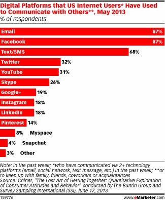
The evaluation comes in the form of a report by Gigya, a developer of social media plugins, gamification and other services. Its findings reveal that only about 2% of social sharing happened on Google+ during the second quarter of 2013 (April through June).
Instead, social sharing is far more “happening” in three other social zones: Facebook (50% of all share activity); Twitter (24% of share activity) and Pinterest (16% of activity).
These same three social sites are the top sharing destinations from e-commerce sites as well as publishing/media sites, too – whereas Google+ is stuck at the same 2% level.
If anything, Pinterest is the “breakout star” in this constellation.
What does Google have to say about these rather sorry-looking statistics, more than three years after the debut of its Google+ social platform?
Google argues that a significant degree of sharing on Google+ happens “privately,” making the activity invisible to data crawling.
But that’s not how Gigya has captured the data; it’s measuring clicks via social tools that are embedded on its client sites (Gigya serves more than 700 brands including ones like ABC, Verizon, Nike and Toyota).
And under that scenario, it’s still clear that very few visitors are clicking to share any Google+ content.
Searchmetrics and other groups have posited that Google+ sharing might overtake Facebook by 2016. But upon closer examination, it appears that these predictions are the result of questionable definitions: +1 clicks on Google+ aren’t the same thing as “shares” on Facebook. A more fitting comparison would be Facebook “likes.”
Viewed on that basis, Google appears to pose no threat at all – short- or long-term – for overtaking Facebook in the social media marathon.
Are any readers using Google+ for the majority of their social media interactions? If so, I’m interested to hear what you like best about the platform – and why you might prefer it to the alternatives. Certainly, if the rest of us are missing something, we want to learn about it!
On the other hand, if you’re like me and giving Google +1 pretty wide berth, let us know why as well. Please feel free to leave a comment.